In response to the financial crisis of 2008, the Fed injected unprecedented levels of liquidity into the banking system. While inflation has been modest to date, an analysis of similar periods in history shows that it typically takes more than two years for the impact on consumer prices to be seen. Consequently, we are now at a pivotal point in the current cycle as Fed stimulus began more than two years ago. [Let me explain further.] Words: 2755
So says Marvin Bolt (www.alphaplus-advisors.com/) in an article* which Lorimer Wilson, editor of www.munKNEE.com , has further edited ([ ]), abridged (…) and reformatted below for the sake of clarity and brevity to ensure a fast and easy read. Please note that this paragraph must be included in any article re-posting to avoid copyright infringement. Bolt goes on to say:
- small-company stocks vs. large-company stocks;
- gold;
- treasury-indexed bonds;
- energy stocks; and
- consumer staples vs. consumer cyclical stocks,
we conclude that inflation should surpass 4% in the next 12 months and 6% within three years.
As the forecast is derived from market-based indicators, it is only a snapshot in time. Daily changes in the indicators will naturally lead to changes in the outlook. We therefore summarize in detail the inputs to the forecasting models, so the reader can monitor and update the indicators as needed.

ANALYSIS
As shown in Figure 1, the financial crisis of 2008 caused the Federal Reserve to inject enormous amounts of liquidity into the financial system leading to a surge in the monetary base. Excess reserves held by commercial banks, plus currency in circulation, are the most liquid forms of money and make up the monetary base. Bank lending combined with consumer & business spending are the mechanisms that circulate this base money – sometimes referred to as “high powered” money – throughout the economy. In a normal economic environment, growth in the monetary base eventually stimulates the economy. If high-powered money is the juice, then the banks are the straw that stirs the drink. The Fed has the ability to directly control excess reserves in the banking system, which presently accounts for approximately 60% of the monetary base, and therefore has the ability to stimulate growth in base money…
The approach of this study was to survey a wide range of market statistics in search of correlations between market-based indicators and future inflation. The idea is that markets themselves are often the best leading indicators. For example, do rising gold prices really forecast future inflation, as many investors believe? If so, by how far in advance? We considered many statistics including each sector of the S&P 500 Index, such as financial, energy or technology stocks. We considered a variety of fixed income products, such as corporate and high-yield bonds. We also tested various commodities, including gold, for correlations with future inflation. Our search resulted in an inflation forecast for three different timeframes using five distinct indicators:
- Small-cap Outperformance: The relative outperformance of small capitalization stocks versus large capitalization stocks is used to forecast inflation 13 quarters in the future.
- Gold: Gold price performance is used to forecast inflation 5 quarters hence; and
- Energy and consumer stocks, and Treasury Inflation Protected Securities (TIPS) performance is used to forecast inflation with an 8-month outlook.
An explanation [of the above] might be found in the profile of a typical small company versus its larger counterpart. On average, a small company could be expected to have less ability to differentiate its products or services. It would typically be domestic, with modest profit margins, and little negotiating leverage in its business model. For example, a small company might be a supplier to a large multinational corporation. A period of rising prices could help ease the pressure on small-company profit margins by helping to nullify its poor negotiating position with suppliers and customers. [On the other hand, while] a large company will often have a strong competitive position in its industry which is how it grew to be large in the first place, rising input costs from raw materials or labor can hurt profit margins. In general, a period of rising prices would help neutralize the disadvantages of being small, while reducing the benefits that come from economies-of-scale or proprietary products found at large companies.
In other words:
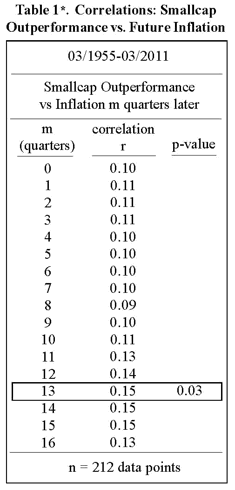
History shows that the relationship is strongest between small-cap outperformance in the current quarter and inflation 13 quarters into the future with a p-value of 0.03 which indicates that the relationship is statistically significant with 97% confidence [i.e.] there is only a 3% chance that the relationship is due to pure coincidence.
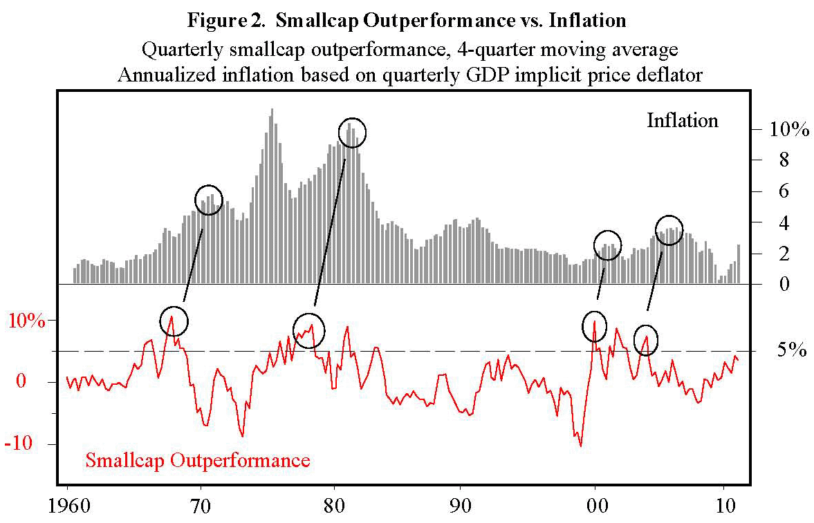
In Figure 2 [ab0ve] we see that small-cap outperformance above 5% has indeed led to rising inflation. Such a comparison helps identify and contrast the relative peaks and pivotal turning points in both data sets, however it does not clearly show the relationship for other data not at the extreme readings. For this purpose, consider the series of charts shown in Figure 3.
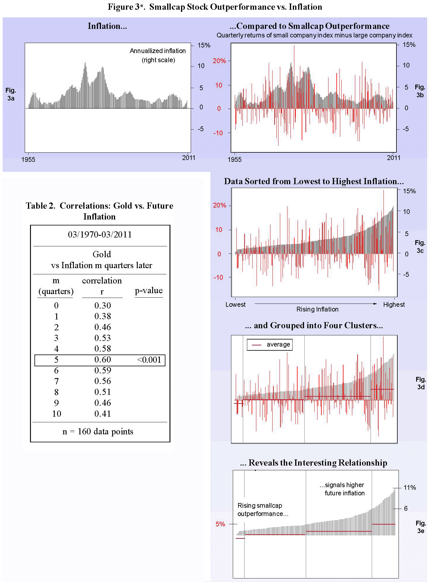
*Figure.3: Quarterly data through March 2011. Annualized inflation from GDP implicit price deflator. Small- and large-company stock indexes from Ibbotson. Small-company index measures the returns of stocks in bottom quintile of all equities traded on Nasdaq, AMEX and NYSE ranked by market capitalization. Small-company index average market capitalization is approximately $500 million. Ibbotson large-company index similar to OEX 100 Index, which represents the largest 100 US stocks ranked by market capitalization.
By overlaying each data set, re-sorting the data from lowest to highest inflation, and focusing on the four clusters of small cap outperformance as indicated in Figure 3d, we have a better understanding of the relationship. Specifically: a positive correlation exists across the entire range of inflation, but is strongest for the extreme inflation readings between 6% and 11%.

Figure 4 illustrates the well-known history that inflation is bad for the stock market. Based on data since 1955, this analysis demonstrates that rising inflation typically leads to a steady deterioration of large-cap equity performance, albeit with weak statistical significance (p=0.23). Furthermore, when inflation surpasses 5%, the average quarterly returns of large company stocks is near zero, as shown in Figure 4. The addition of this data set to our overall analysis suggests a curious cycle:
2. Gold Performance vs. Rising Inflation
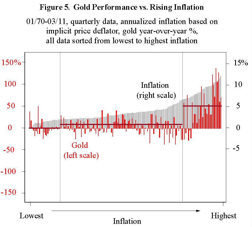
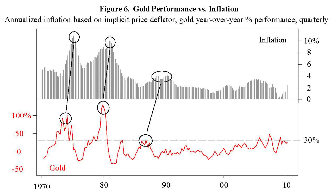
Table 2 [above] shows that the strongest correlation between the year-over-year performance of gold and future inflation exists after 5 quarters… [and that] there is less than a 1% chance that it is due to coincidence. An overlay of the raw data, sorted from low to high inflation, is shown in Figure 5. Notice the relationship is substantially stronger for rapidly rising gold prices and the corresponding highest levels of inflation.
A comparison of the two data series, as shown in Figure 6 [below], provides more insight. Here, we see the critical value for gold performance is approximately 30%.
In other words:
Our third approach bases the outlook for inflation on the performance of three different market statistics:
- S&P Energy Services Sector: This sector (symbol: XLE) reflects the impact of changes in energy prices, primarily crude oil. Higher oil prices benefit the companies in this sector, which drives the index higher. At the same time, energy prices feed into inflation by increasing the cost of fuel for consumers and businesses, as well as raw material and other inputs costs for manufacturers and transportation companies. Hence, it is easy to understand how the returns of energy stocks could be a signal of future inflation.
- Treasury Inflation Protected Securities: TIPS are inflation-indexed bonds which were first offered in the 1990s to provide investors in government fixed-income securities with a hedge against inflation. TIPS pay a variable coupon that rises and falls with the Consumer Price Index (CPI). Investors buy TIPS instead of traditional government securities when they believe inflation will rise.
- Spread between S&P Consumer Durables and S&P Consumer Cyclical Stocks (XLP-XLY): Companies in the consumer durables sector are the least sensitive to fluctuations in the economy. Consumer durables can be thought of as “soups, soap & cereal stocks” as these are typical products that consumers continue to buy during a slowing economy. In contrast, companies in the consumer cyclical space are the most economically sensitive. Examples might include retail department stores, car manufacturers, or makers of other big-ticket items where consumers can delay the purchase during a difficult economy. Investors will tend to favor stocks in the consumer durables sector over cyclicals when they anticipate an environment that is less favorable to the economy and stock market, such as periods of rising inflation.
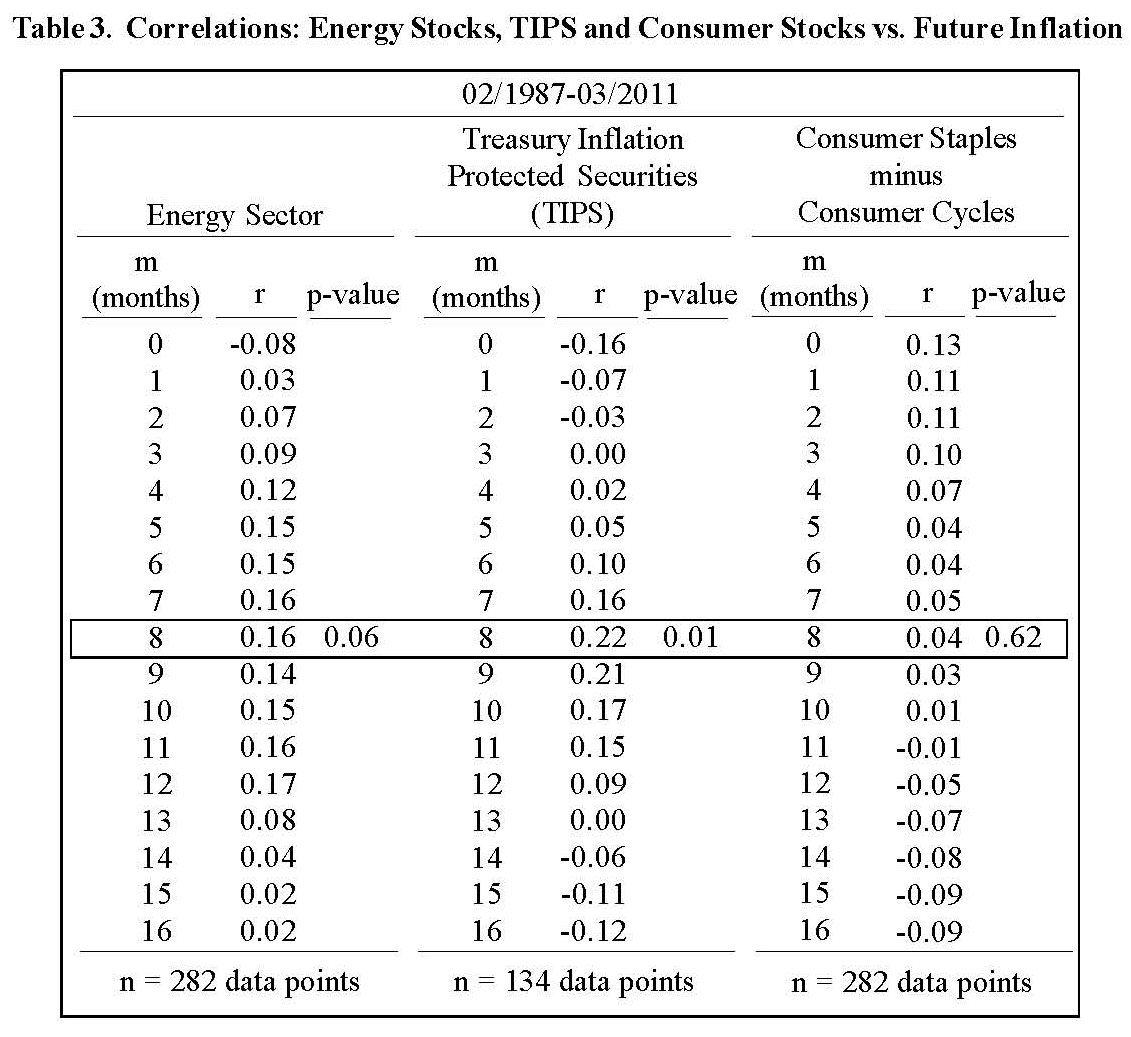
In order to develop a more robust composite indicator, a multifactor model was created by multiplying the market-based indicators with a fixed weighting and adding all three together. Each indicators was selected independently for its ability to forecast future inflation. Table 3 [below] shows the correlation histories. A forecast period (m) of 8 months is where the largest average correlation exists for all three indicators.
The weightings were optimized to provide the best fit to the past data, resulting in the following model: Inflation indicator = 3 x TIPS + 2 x XLE + 1 x (XLP – XLY)
- peaks and troughs have consistently led fluctuations in inflation by about 8 months, and
- the magnitude of model’s readings have been roughly in proportion to the levels of inflation.
As shown in Figure 7d [below], the composite model is presently near the high end of its range since 2000, which translates into:
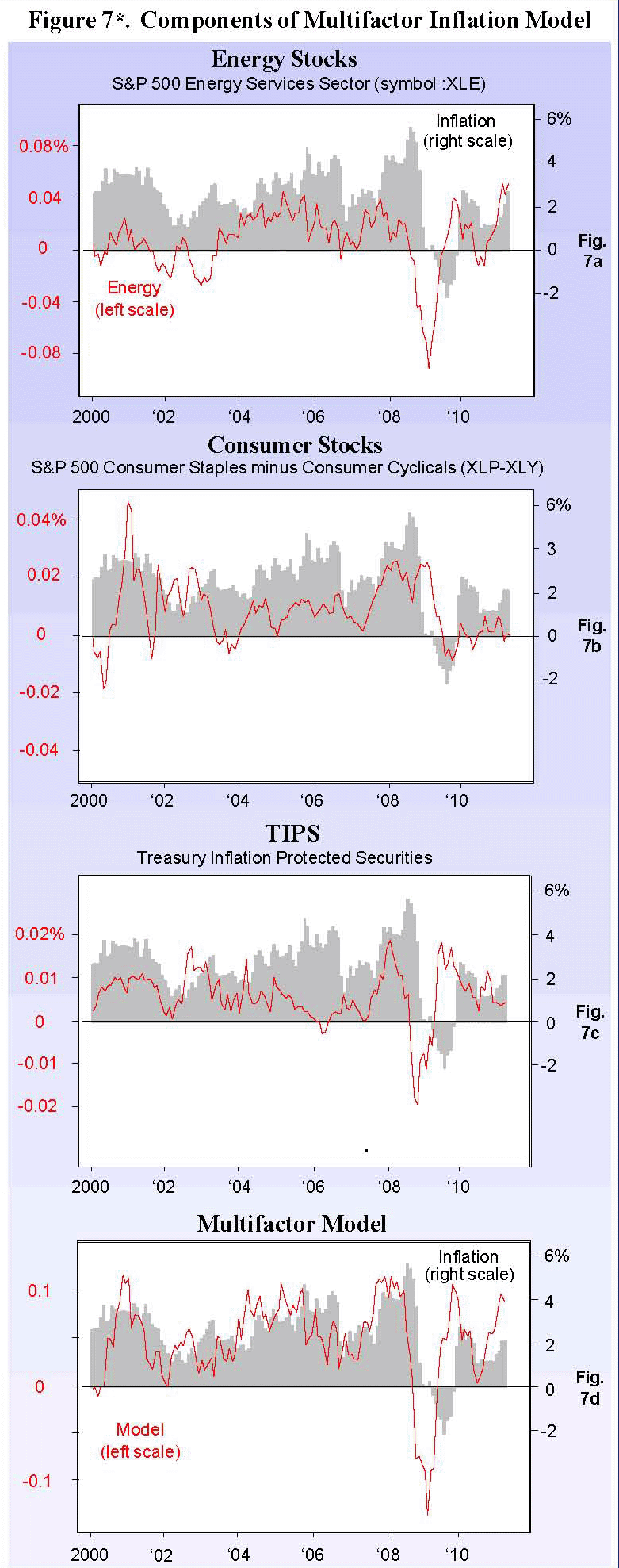
* Figure 7: Monthly data through March 2011. Annualized inflation from Consumer Price Index (CPI). TIPS performance based on average total return of PIMCO Real Return Instl mutual fund (PRRIX) and Vanguard Inflation Protected Secs Inv mutual fund (VIPSX).
Investment Opportunities
1. TIPS: As seen in Figure 7c, TIPS have historically shown a strong correlation with future inflation (p=0.01 with 8 months lead time). However, the recent performance of TIPS has been modest, which suggest a possible investment opportunity. If, in the future, other indicators discussed herein (smallcap outperformance, gold, and the multifactor model) give strong signals of future inflation, while TIPS still lags in performance, then treasury-indexed bonds could represent an attractive investment.
2. Consumer stocks: Strong signs of future inflation will suggest that investors should be prepared to buy consumer staples and, at the same time, sell short consumer cyclicals. The timing of the trade should be just prior to the anticipated arrival of inflation based on the various indicators profiled in this study.
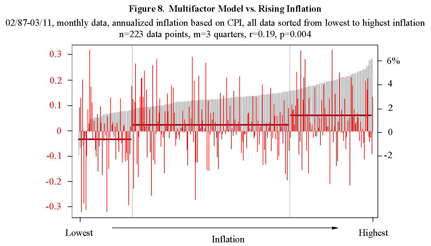
Figure 8 [above] shows the readings for the multifactor model vs inflation 8 months later for all months since 1987. We see that the correlation between the model’s signals and future inflation is consistent across the entire spectrum. When the model’s readings are at or below zero, inflation has been low, while the higher readings correlate with stronger inflation. Furthermore, the relationship is highly significant with a p-value of 0.004.
CONCLUSIONS
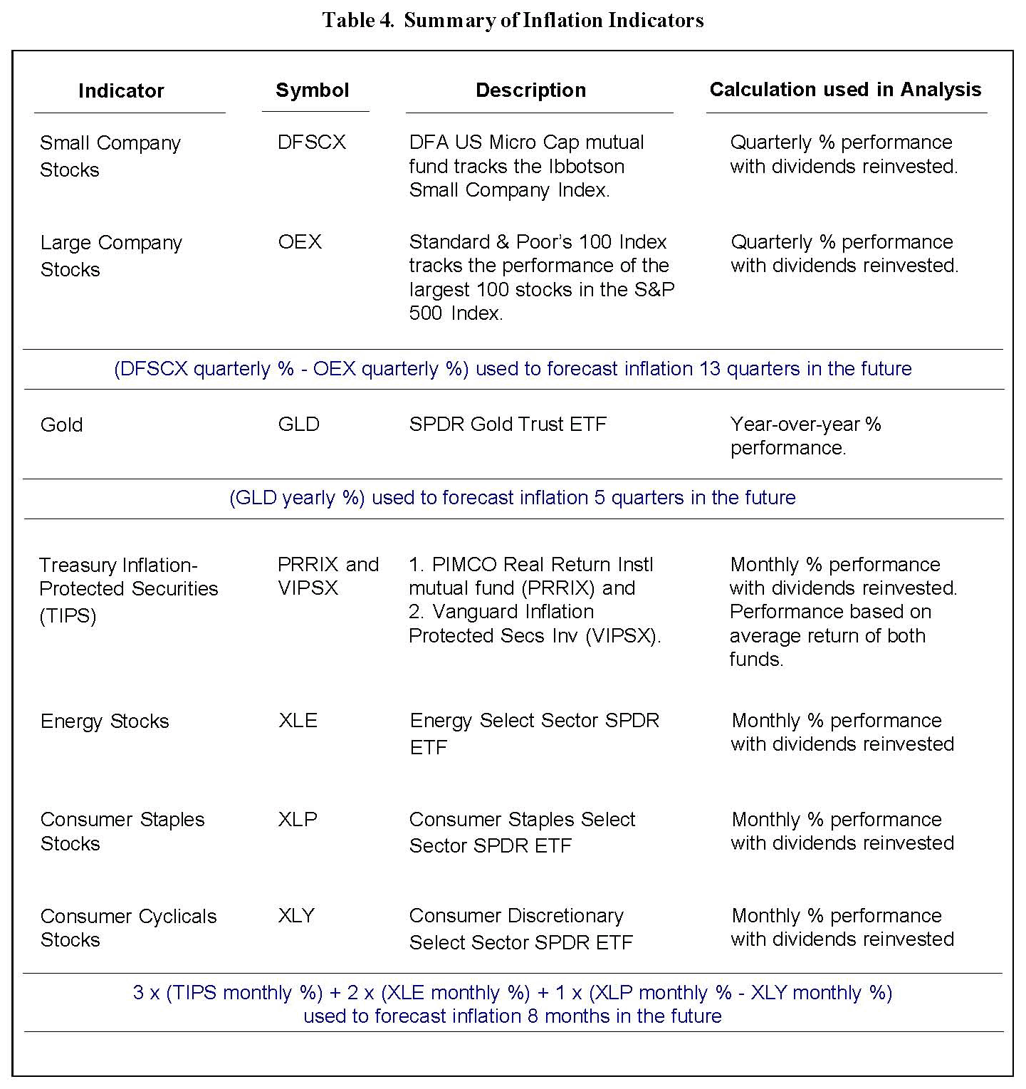
Table 4 [below] provides a recap of each specific indicator used in the entire analysis. Our attempt has been to describe the approach with as much clarity and description as possible, so the reader can recreate the analysis if desired. A more practical suggestion is to simply monitor each indicator on a regular basis, while focusing on the background descriptions provided herein. For example:
- are the TIPS mutual funds shown in Table 3 (symbols: PRRIX and VIPSX) rising in price? They have the largest weighting in the model for the 8-month inflation outlook.
- Is the spread between DFSCX and OEX increasing, which would be a sign of rising inflation within 3 years? This casual approach is less precise, but we believe will still be useful for those seeking early warnings of rising inflation.
Be aware, however, that it is important to monitor an indicator’s performance including reinvested dividends. Stockcharts.com is free website that shows the total return for an index, including dividends, using its chart type called PerfChart. Many other services will show the price performance of a fund or index, but often without including dividends.
Considering all inputs as of the end of March, 2011, our overall outlook is for inflation to rise to 4% within one year, and 6% within three years.
We note, however, that the indicators will fluctuate on a daily basis as they are derived from trading activity in financial markets. As a result, this forecast only reflects a snapshot in time. The reader is encouraged to monitor the indicators in real-time for an up-to-date outlook.
*http://seekingalpha.com/article/272190-5-market-based-indicators-point-to-1-to-3-year-inflation-outlook
Links to other related articles:
- What Inflation? Take a Look At All the Deflation Around You! https://munknee.com/2011/05/what-inflation-take-a-look-at-all-the-deflation-around-you/
- Inflation Coming? Treasury Market Says Otherwise! https://munknee.com/2011/05/inflation-coming-treasury-market-says-otherwise/
- Official and ShadowStats Monthly Inflation Rates: 1872 to Present https://munknee.com/2011/03/official-and-shadowstats-monthly-inflation-rates-1872-to-present/
- Understanding Inflation: It’s Here – and It’s Going to Get Worse, Much Worse! https://munknee.com/2011/03/understanding-inflation-its-here-and-its-going-to-get-worse-much-worse/
Editor’s Note:
- The above article consists of reformatted edited excerpts from the original for the sake of brevity, clarity and to ensure a fast and easy read. The author’s views and conclusions are unaltered.
- Permission to reprint in whole or in part is gladly granted, provided full credit is given as per paragraph 2 above.
- Sign up to receive every article posted via Twitter, Facebook, RSS Feed or our FREE Weekly Newsletter.
Inflation
Anyone that is so stupid as to use the offical CPI figures to plot on a graph realy needs to see a doctor.
Sure it’s 4% if your dead but for those of use that eat, drink or drive know these figures are more then a little doctored.
Maybe these experts that beleive these figures are the same experts that were handing out ‘AAA’ to the banks back in 2008 only to see these banks go bust a few months later.
How silly can you be or did you not know that the M4 money supply in the USA is going up by 14% p.a
Sorry mate but don’t give up the day job.