![]() The unemployment rate declined [slightly in October] from 9.1% to 9.0%…[but a close look, in chart form, at the pattern of
The unemployment rate declined [slightly in October] from 9.1% to 9.0%…[but a close look, in chart form, at the pattern of  unemployment compared to the S&P 500, the extent of unemployment over 27 weeks duration, the ratio of employed people to those aged 16 and over, the average length of unemployment and how extensive unemployment has been in this most recent recession compared to each of the others over the past 60+ years, is very revealing as to how serious the situation is. It is very depressing, indeed.] Words: 601
So says Doug Short (http://advisorperspectives.com) which Lorimer Wilson, editor of www.munKNEE.com (Your Key to Making Money!), has further edited ([ ]), abridged (…) and reformatted below for the sake of clarity and brevity to ensure a fast and easy read. The author’s views and conclusions are unaltered and no personal comments have been included to maintain the integrity of the original article. Please note that this paragraph must be included in any article re-posting to avoid copyright infringement.
Who in the world is currently reading this article along with you? Click here
Short goes on to say, in part:
Chart # 1
The chart below shows: the pattern of unemployment, recessions and both the nominal and real (inflation-adjusted) price of the S&P Composite since 1948.
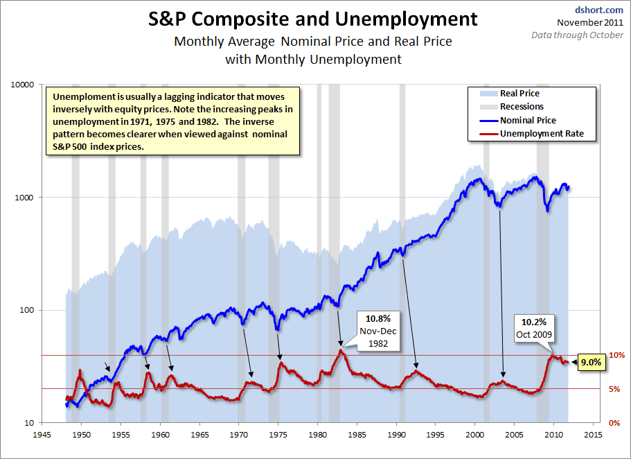
Unemployment is usually a lagging indicator that moves inversely with equity prices (top chart). Note the increasing peaks in unemployment in 1971, 1975 and 1982. The inverse pattern becomes clearer when viewed against real (inflation-adjusted) S&P Composite, with its successively lower bear market bottoms. The mirror relationship seems to be repeating itself with the current and previous bear markets.
Chart # 2
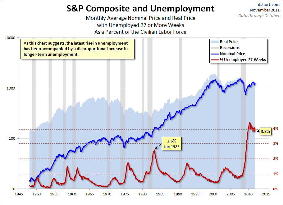
Chart #3
The third chart (below) shows: the ratio of the number of employed people to the total civilian population age 16 and over and is an overlay of the unemployment rate and the employment-population ratio.
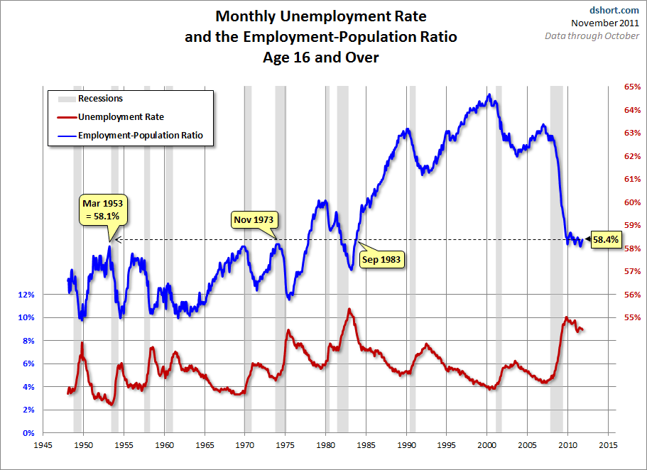
The inverse correlation between the two series is obvious. We can also see the accelerating growth of two-income households in the early 1980s. The July 2011 ratio was a modern low of 58.1% – a level not seen since the 58.1% ratio of March 1953, when Eisenhower was president of a country of one-income households, the Korean War was still underway, and rumors were circulating that soft drinks would soon be sold in cans. The latest ratio is consistent with levels of the early 1980s.
The employment-population ratio will be interesting to watch going forward. The first wave of Boomers will be a downward force on this ratio. The oldest of them were eligible for early retirement when the Great Recession began, and the Boomer transition to retirement will accelerate over the next several years.
Chart #4
The fourth chart (below) shows: the average length (weeks) of unemployment…We are perhaps seeing a paradigm shift [as a] …result of global outsourcing and efficiencies of technology. The post-recession duration of unemployment has continued to rise, although the October 39.4 is off last month’s all-time high of 40.5. It had approached a level nearly double the peak in 1983 following the 1981-82 recession.
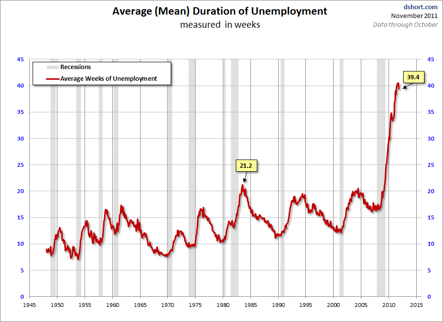
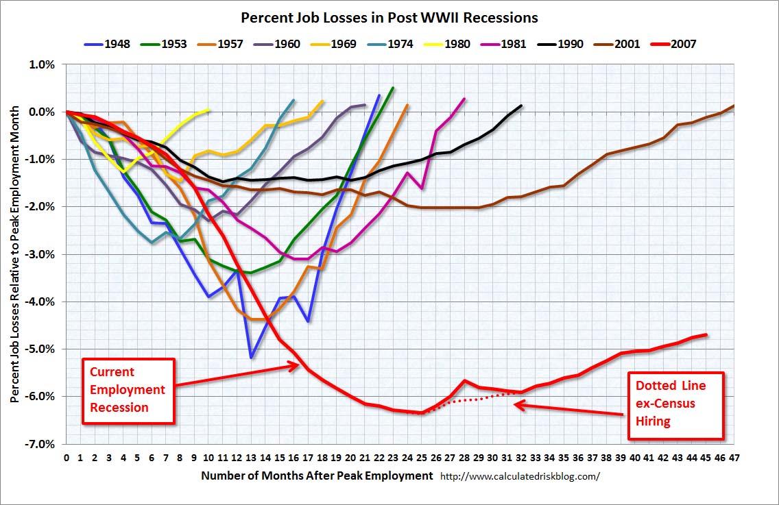
Chart #5
The last chart (below)…shows: the percent of job losses from the peak employment month prior to every recession since 1948 (the earliest monthly unemployment figures collected by the Bureau of Labor Statistics). Note the addition of the dotted-line alternative for the current cycle, which shows unemployment excluding the temporary census hiring.
*http://advisorperspectives.com/dshort/updates/Unemployment-and-the-Market.php
Related Articles:
1. New Report Confirms that “Occupy Wall Street” Has a Point Regarding Income Inequality in America
Of all the many banners being waved around the world by disgruntled protesters from Chile to Australia the one that reads, “We Are the 99%” is the catchiest. It is purposefully vague, but it is also underpinned by some solid economics. A report from the Congressional Budget Office (CBO)… confirms the contentions of the 99% that a system that works well for the very richest has delivered returns on labour that are disappointing for everyone else and that the people at the top have made out like bandits over the past few decades, and that now everyone else must pick up the bill. [Take a look at the graph which shows just how unequal income distribution is in the USA.] Words: 776
2. Increased Productivity Has Benefited Your Employer – Not You! Here’s Proof
In the past 20 years, the US economy has grown nearly 60 percent. This huge increase in productivity is partly due to automation, the internet, and other improvements in efficiency but it’s also the result of Americans working harder—often without a bigWords: boost to their bottom lines. Oh, and meanwhile, corporate profits are up 20 percent. [Let me show you exactly what I mean.] Words: 550
3. Never Have SO Few Owned SO Much – Where Do You Place in the Wealth Hierarchy?
[The fact that] the top 1% has prospered incredibly while the bottom 99% have been screwed royally is supported by countless data. New data show this is a global phenomenon and that even in the worst of economic times the wealthiest make out like the bandits they are, and there are a lot more of them than 1%. [Let’s take a look at what the data actually says.] Words: 7814. These 10 Charts Illustrate America’s Disastrous Fiscal Condition – Take a Look (and Weep)!
By now nobody should have any doubts as to just how disturbing America’s fiscal debacle is. For those naive and innocent few who still think there is a Hollywood ending with a pot of gold awaiting everyone at the end of the rainbow, we present the following “10 essential fiscal charts” from the Pew Policy Institute