As gold and silver have, for the most part, been moving in the same direction as commodities since about 1971 (and especially since 2001), most people think that this relationship will continue. However, it will not. A major divergence has been in the works since about 2008/2009 and it is about to escalate and this change…has brought about exactly what gold & silver miners needed to start performing well. Are you ready for the next leg of deflation?
The comments above and below are excerpts from an article by Hubert Moolman (HubertMoolman.Wordpress.com) which has been edited ([ ]) and abridged (…) to provide a faster and easier read.
Here are a few charts to support the continued deflation [and my contention that gold, silver and their mining stocks will perform much better than they did during the first part of the bull market].
Oil
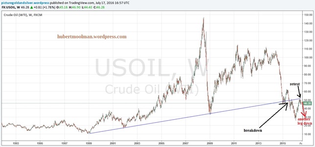
Below is a chart for oil (from tradingview.com) since 1992. The bull market for oil started in 1999, which has been supported by the trend line drawn from 1999. In 2015 there was a breakdown from that support — and prices have already retested the line (now a resistance line) twice. This confirms the end of the oil bull market. Prices are likely to continue much lower from here. This is consistent with my previous (more longer-term) analysis, where I explain why oil could go lower than $10 per barrel.
Gold to Oil Ratio
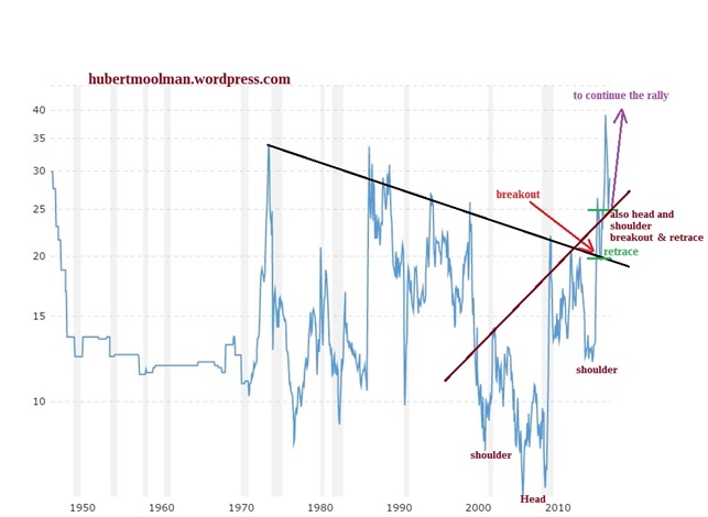
Below is a long-term chart (from macrotrends.net) of the Gold/Oil ratio that supports the expected escalation of the divergence between gold and oil. On the chart I have drawn a resistance-type line that has been in place since the early 70s. In 2015 there was a strong breakout of this line. The ratio has gone a lot higher since the breakout, which is a good confirmation. The move higher has also broken the neck-line of the Head&Shoulders Bottoming pattern – and this indicates that the ratio is likely to soon go even higher (especially given the recent retrace to the neck-line)…
Commodities: CRB Index
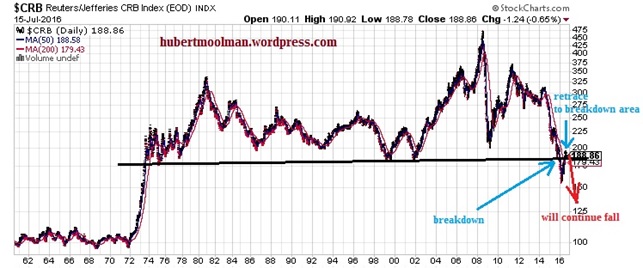
…The recent bull market for commodities started in 2001 from a support line that has been in place since the middle of the 70s [see chart below]. In 2015 there was a breakdown from that support. Subsequently, prices have now retested the line. This is a major breakdown, which should not be taken lightly. Although price is slightly higher than the line, it still qualifies as a retest of the breakdown. Therefore, it is very likely that the decline will continue soon. Prices could go as low as the 100-level, at least.
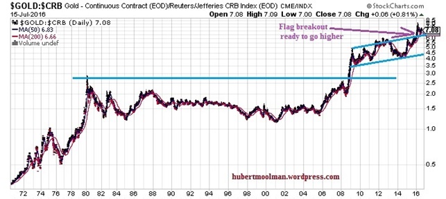
Gold to CRB Ratio
…On the chart below it is clear that the Gold to CRB ratio broke higher than its 1980 high, in 2008. Since then, it has been forming an extremely bullish looking Flag pattern. In 2015 it broke out of the Flag pattern. Consequently, after the retest of the breakout, it appears ready to continue much higher.
Conclusion
The above charts confirm that:
- conditions for gold and silver stocks are looking really good, since lower oil and commodity prices will boost their profit margins.
- Furthermore, with general stocks (crash still coming), commodities and oil being in a bear market, there will not be much competition for investments into gold, silver and their related stocks like there was during the first part of the precious metals’ bull market (2001 to 2011).
The above means that gold, silver and their mining stocks will perform much better than they did during the first part of the bull market…