Below are 9 exciting gold charts which clearly show that gold is about to move forward – greatly – in the months to come. Take a look at why that is the case and then take action as your means permit.
The above is a introduction to the original article* by Peter Degraaf (pdegraaf.com/) entitled Some exciting gold charts for you!.
[The following article is presented by Lorimer Wilson, editor of www.munKNEE.com and the FREE Market Intelligence Report newsletter and may have been edited ([ ]), abridged (…) and/or reformatted (some sub-titles and bold/italics emphases) for the sake of clarity and brevity to ensure a fast and easy read. This paragraph must be included in any article re-posting to avoid copyright infringement.]
Below are edited excerpts from that article:
1. Gold Seasonality
Historically, the month of March is not very ‘gold-friendly’ but…
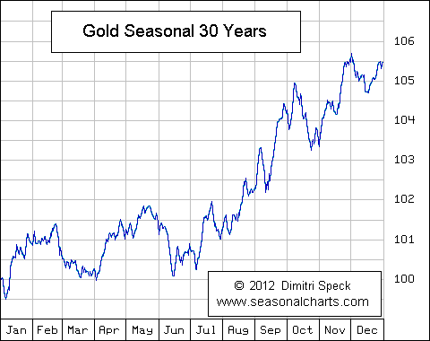
April and May are more conducive to providing a rally. The March pullback came on schedule and appears ready to turn into a rally, – see gold chart in this essay. (Chart is courtesy of Seasonalcharts.com.)
2. Number of US Dollars Currently Circulating
The number of USD circulating is over 1 trillion dollars (including many $100 notes), rising exponentially, and…
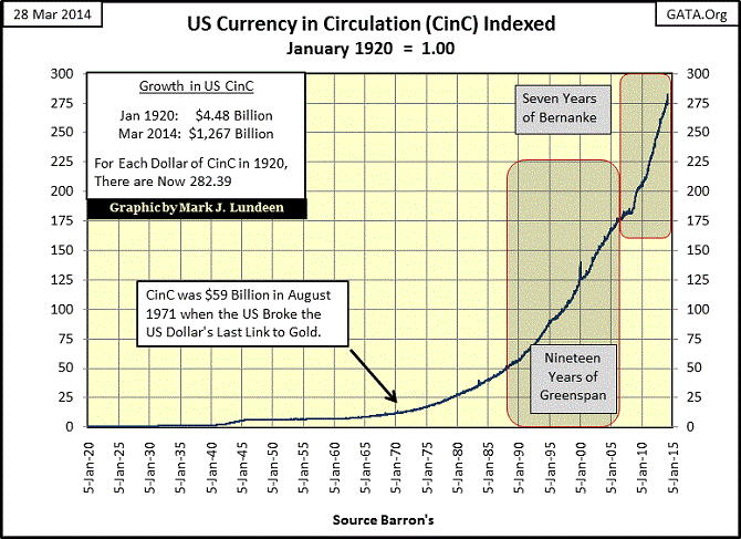
this is in addition to the trillions of dollars in digital form, which make up the money supply. (Chart is courtesy of Mark J. Lundeen)
3. The US Monetary Base
The two tiny ‘blips’ in yr 2000 and 2001 represent the large amounts (at the time) of money shoveled into the system by Mr. Greenspan to keep the system afloat during Y2K and ‘911’.
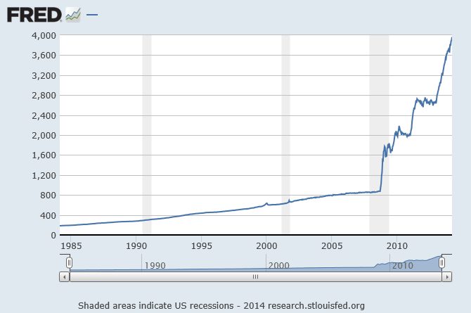
The amount of money that is added at this time is mind boggling. During the last 30 day period the base increased by 80 billion dollars. No ‘tapering’ here. While not all of this money will find its way into gold and silver, some of it will, and as the rally that began on December 31st picks up steam, more and more of this liquidity is expected to move into the precious metals sector. (Chart is courtesy Federal Reserve Bank of St. Louis.)
4. A Comparison of Gold to the US Monetary Base
The interpretation is that gold is cheaper than at any time during the past 100 years!
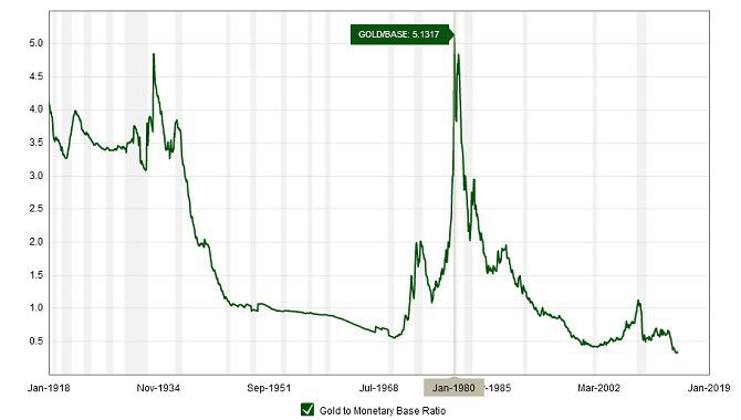
The current reading is 0.4 and…when it climbs back to the 4.0 zone, (10 times today’s gold price), it will be time to sell gold and look for something else. (The chart is courtesy Macrotrends.net)
5. A Comparison of the Current Gold Price to the Purchasing Power of a US Dollar in 1920
The chart below, courtesy of Mark J. Lundeen, confirms the fact that gold is very cheap at this moment.
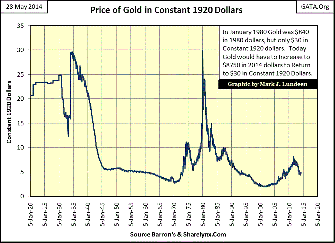
Mr. Lundeen calculates that gold needs to rise to $8750 in today’s dollars to return to what it was worth in 1920. This sets the stage for a continuation of the current gold bull market. Mr. Lundeen has created a similar chart for silver (not shown) which shows silver would need to rise to $435/ounce to equal its worth in 1920. This price dovetails with the price arrived at by Mr. John Williams at Shadowstats.com.
6. A Comparison of Fed Assets with the Performance of Gold and the S&P 500.
The chart below is by Mr. James Turk, as shown on kingworldnews.com, and shows the energy that is being provided by the US FED (by way of money printing), benefiting both the S&P (red line), and gold (black line).
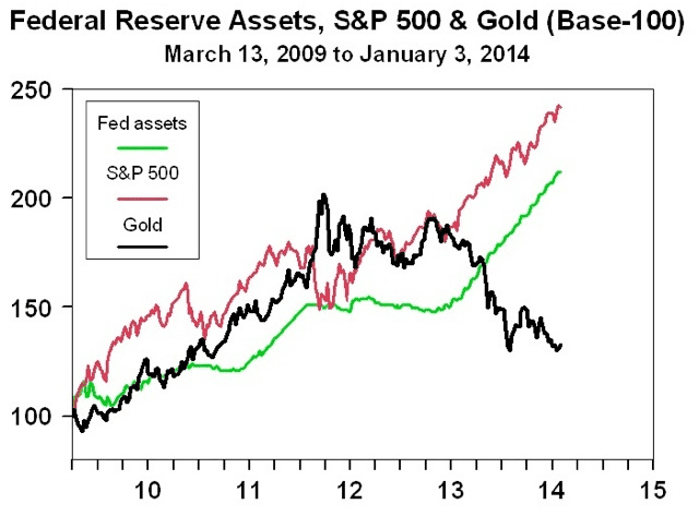
The gold price was pushed out of this relationship when huge numbers of contracts for paper gold, representing 15% of total world gold production, were executed at the COMEX in mid-April 2013…Meanwhile, to fill demand from China, hundreds of tonnes of physical gold were released by the Bank of England, while a large amount of gold was pried away from GLD the gold ETF, in response to rising demand from Asian countries…This has created a situation where, like a rubber band, the gold price is expected to snap back into the previous alignment, (unless you expect the FED to stop printing money).
7. The Daily Gold Chart
Price broke out at the 200DMA (red line) in February and since meeting with resistance at $1400, a test of the breakout has been underway.
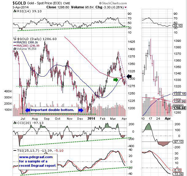
The supporting indicators (green lines), are providing hints that support is available here. A breakout at the black arrow will tell us that a bottom may well have been carved out. The green arrow points to a ‘golden cross’, with the 50DMA moving into positive alignment with the 200DMA.
8. A Comparison of Gold to the S&P 500 Index
In late 2011 this index became temporarily tilted in favor of gold. The reversal of direction that came about as gold dropped in price while the S&P 500 rose to new highs, appears to be ready to change direction again.
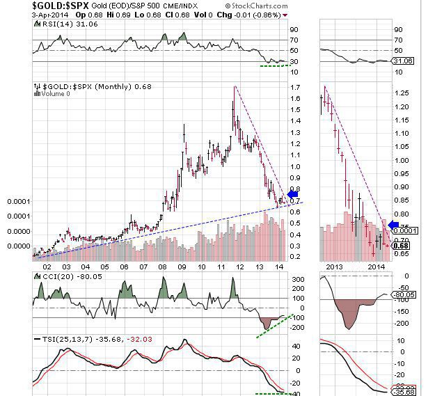
Confirmation will come about when price breaks out at the blue arrow. The three supporting indicators (green lines) are ready to turn up. (The above and following charts are courtesy Stockcharts.com unless indicated otherwise.)
9. A Comparison of the Price of Gold to the US Long Bond
The blue line in the chart below depicts the 400 week moving average. Up until 2003 it made sense to own bonds and not gold. The green arrow points to the moment when gold took charge. Since then gold has outperformed bonds. In 2011 gold had moved up a bit ‘too far too fast’ and a pullback in the relationship caused this index to return to the 400WMA, where it is finding support.
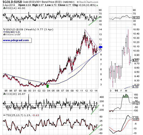
A breakout at the blue arrow will cause many people to become interested in gold, and bond money is expected to flow into the gold sector, as the eleven year old trend picks up steam.
[Editor’s Note: The author’s views and conclusions in the above article are unaltered and no personal comments have been included to maintain the integrity of the original post. Furthermore, the views, conclusions and any recommendations offered in this article are not to be construed as an endorsement of such by the editor.]
*http://www.pdegraaf.com/archive.html (©2013 Peter Degraaf Investments, All rights reserved. Go here for a sample copy of his daily (subscription) market letter.DISCLAIMER: Please do your own due diligence. Peter Degraaf is not responsible for your investment decisions.
Related Articles:
1. These 10 Charts Suggest the Outlook for Gold Is Good for 2014 and Beyond
Very poor sentiment towards gold and oversold conditions is reminiscent of the conditions seen in late 2008 and January 2009 [as seen in the chart below] when gold prices had fallen by more than 25% in 9 months. Subsequently, gold rose from a low on January 15, 2009 at $802.60/oz to a high less than 12 months later at $1,215/oz for a gain of over 50%. A similar move today would see gold above $1,800/oz by year end. Read More »
2. “Golden Cross” Suggests MUCH HIGHER Prices Coming for Gold, Silver & PM Equities

History is testament that there exists monumental probability (76% to 100%) that 2014-2016 will witness impressive gains for Gold, Silver and Precious Metal Equities…across the board. Below are charts of 8 different forms of precious metals assets that show that Golden Crosses are a fait accompli or are about to experience imminent completion thus heralding an immediate new Bull Market and that the forth-coming secular bull markets in all forms of precious metals may well far surpass the forecasts herein stated. The focus of the following analysis is to prove the predictable accuracy and timing of the The Golden Cross. Read More »
3. The Future Price of Gold and the 2% Factor
It is my contention that the price of gold rallies whenever the U.S. dollar’s real short-term interest rate is below 2%, falls whenever the real short rate is above 2%, and holds steady at the equilibrium rate of 2%. Let me explain. Read More »
4. Gold Going Parabolic In 2014 – Here’s Why
We are now starting the hyperinflationary phase in the USA and many other countries – and this will all start in 2014. What will be the trigger? The answer is simple – the fall of the U.S. dollar. Read More »
5. Rickards: Gold Going to $7-9,000/ozt. in 3 to 5 Years! Here’s Why
Gold is technically set up for a massive rally to $7,000 to $9,000 per ounce in three to five years based on a collapse of confidence in the dollar and other forms of paper money. Read More »