Gold and Dollar at Biggest Inflection Point of the Year
At present the USD is at yet another major inflection point and what it does from here will have direct implications for U.S. investors, not only asset allocation (bonds, stocks, commodities, currencies) but also sector allocation (cyclicals, non-cyclicals). [Let’s take a closer look at the situation.] Words: 2102
So says Chris Puplava (www.financialsense.com) in another article* on the USD and the eventual price of gold (see here 1) which Lorimer Wilson, editor of www.munKNEE.com (It’s all about Money!), has further edited ([ ]), abridged (…) and reformatted below for the sake of clarity and brevity to ensure a fast and easy read. Please note that this paragraph must be included in any article re-posting to avoid copyright infringement. Puplava goes on to say:
Weak and Strong USD Relationships with Different Assets and Sectors
When the USD Index [for an excellent article on what the USD Index is – and is not – read this article (2)] is weak the following general relationships are seen:
- Stocks outperform bonds
- Investment grade and high yield bonds outperform U.S. Treasuries
- Foreign stocks outperform U.S. equities
- Commodities are strong
- Commodity currencies outperform USD
- Cyclical sectors (such as Technology, Consumer Discretionary, Materials and Energy) outperform non-cyclical sectors (such as Consumer Staples, Utilities and Health Care)
When the dollar is strong you typically see the reverse of the above relationships…as shown below. U.S. stocks (S&P 500), commodities (CRB Index), and the emerging equities market (EEM) relative to the S&P 500 tend to have an inverse correlation with the USD Index which is shown below in green and inverted for directional similarity. Looking at the figure we can see that when the USD is rising (falling in chart) commodities and the S&P 500 are weak and emerging market equities underperform the S&P 500 (2008, early 2010), and the converse is also true (2009, late 2010-early 2011).
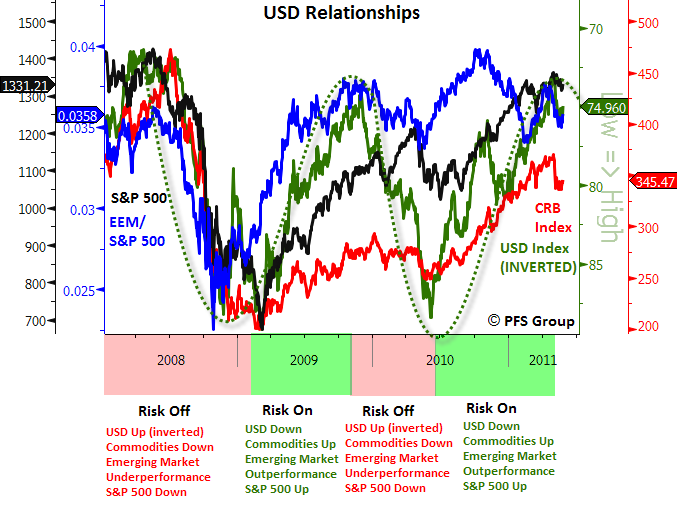
Source: Bloomberg
Movement of USD Index During 1970s vs. 2010/11
Then
So far there has been a remarkable similarity in how the USD [Index] moved in the 1970s to the present, and [as such] I believe it becomes quite valuable to bear that in mind in terms of portfolio management… A look at the figure below shows the USD Index in the 1970s on the top panel and the USD Index presently on the bottom panel. You will notice in the 1970s that the USD Index had a big decline from early- to mid-1973, before it staged a dramatic bounce heading into 1974. The second decline occurred from 1974 to 1975, followed by yet another bounce heading into 1976. [Please refer to this article (3) on what the similarity of the movement in the price of gold in the 1970s could mean for the upcoming price of gold using fractal analysis.]
Sign up for our FREE weekly “Top 100 Stock Index, Asset Ratio & Economic Indicators in Review” report
The moves in the USD Index in the early ’70s created a pennant formation which is formed by lower highs and higher lows. After peaking in 1976, the USD Index steadily declined until late 1977 in which it then accelerated its decline and broke the lower pennant support. In 1978, the USD Index rallied to test the underside of the broken trend line and then fell more than 15% in 109 trading days.
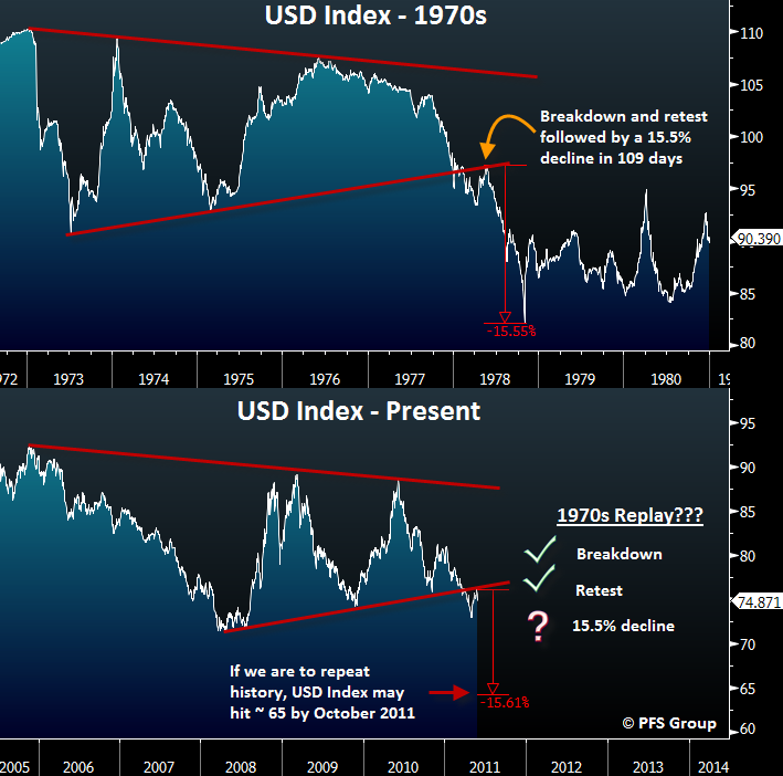
Source: Bloomberg
Now
Looking at the bottom panel, the USD Index looks to be eerily mimicking the 1970s general movements. Back then we saw two big down moves followed by sharp rallies and then a third decline that witnessed a break of the pennant lower trend line. Not only has the USD Index broken the lower pennant trend line as it did in 1977, it has now tested the underside of the lower trend line. [For other supportive articles on the impending crash of the USD – but from a different perspective – go here (4) and here (5).]
Conclusion #1
What comes next, if past is prologue, is a 15% decline in the USD Index to roughly 65.
There is absolutely no guarantee that the 1970s analog will play out in the current case as the USD may have a false breakdown of the pennant and then rally back above into the pennant formation. [Read this article (6) that presents charts showing inherent strength in the USD.] However, the further the USD declines from present levels, the more and more likely the bearish case for the USD is in play and the ‘risk on’ trade has a green light. My personal leaning is that we do in fact continue to track the 1970s example.
Moving Averages of the USD Index
Since the early part of May, the USD Index has been experiencing a short-term rally [referred to as just a “dead cat bounce” in this article (7)]. It looked like it was going to make a move to test its 200-day moving average… [but] once the USD Index broke its 50-day moving average (green line below) the bearish trend resumed.
Who in the world is currently reading this article along with you? Click here to find out.
Presently, the USD Index is testing its 50-day and 20-day moving averages and a decisive close below both would likely indicate the dollar is continuing its decline. Also, given the break in the multi-year pennant formation, the USD’s decline may accelerate to the downside.
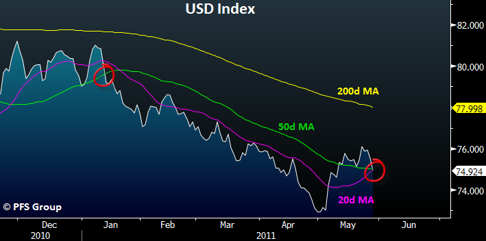
Source: Bloomberg
The USD [Index] vs. Other Currencies and Precious Metals
What supports my belief in the bearish case for the dollar stems from its broad-based weakness to global currencies. Over the last month the USD [index] has experienced a decent bounce, but this strength is deceptive and not as strong as would appear on the surface. To gain an understanding as to how weak/strong the USD is on a global basis I track 30 world currencies and all four precious metals returns relative to the USD [index] over various time frames as shown in the table below.
The USD [Index] began to rally roughly one month ago and the third column from the left shows the 1-month returns relative to the dollar. You can see that only six out of 34 currencies and metals declined relative to the USD [Index], while 82% of them rallied. This indicates that the countertrend bounce has been incredibly weak. A strong reversal in the [USD Index], such as was seen in the summer of 2008 or late 2009, often occurs when it displays widespread strength.
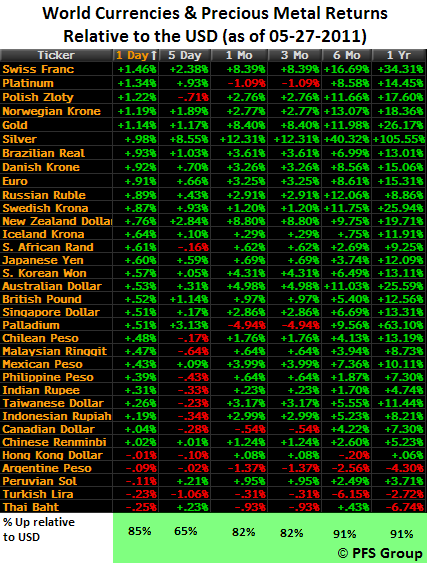
Source: Bloomberg
Conclusion #2
As shown in the table above, whether one looks at a one day relative return or a one year relative return, the USD Index is weak on a global basis and is not showing improving strength that would indicate a major reversal of its bearish trend.
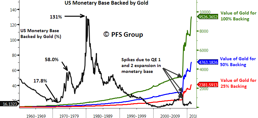
U.S. Governmental Holdings of Gold Bullion vs. the U.S. Monetary Base
If the… [USD Index] does experience a decline similar to 1978 (declining over 15% in less than four months), one of THE primary beneficiaries would likely be commodities in general, and precious metals in particular. With gold already above $1500/ozt., [for some insight into the significance of the term “ozt.” vs. “oz.” read this (8) informative article] some have a hard time imagining how much further it can advance. One way to analyze gold is on a relative basis to help create some price targets and, rather than purely analyze how high gold can rise, we also need to analyze how far the USD can fall as gold and the USD are two sides of a the same coin. Therefore, looking at the value of U.S. governmental holdings of gold bullion in relation to the U.S. monetary base helps in determining some price targets for gold and to gauge how expensive it may be.
Shown below on the left hand side [of the chart] is the percentage of the U.S. monetary base backed by the value of U.S. governmental gold bullion ([troy] ounces of gold x current price). On the right hand side is the required price of gold necessary to back the U.S. monetary base to a set percentage with 25%, 50%, and 100% backing shown.
Source: Bloomberg
I’d like to make a few quick points. First off, please note [above] that the beginning of the secular bull market in gold in the 1970s that took it from $35/ozt. in January 1970 to $835/ozt. ten years later (+2285%) began with gold representing a mere 17.8% of the U.S. monetary base. By the middle of the decade after the first big run in gold, U.S. government bullion holdings represented 58% of the monetary base, and by the peak in early 1980, the value of governmental gold bullion represented 131% of the U.S. monetary base. By the time the secular bull market in gold was over, the value of U.S. gold bullion represented more than the entire monetary base!
While it may come as a huge surprise that after rallying from $254/ozt. in 2001 to a recent high of $1577/ozt. (+520%), the present value of governmental holdings of gold bullion backing the U.S. monetary base is currently BELOW the starting point of the prior secular bull run in gold!
I believe this point is too big not to reiterate, the present value of gold bullion relative to the U.S. monetary base is BELOW where it stood at the beginning of the last secular bull market and a large part of this is due to rapid expansion in the monetary base caused by quantitative easing (QE1 and QE2) by the Bernanke Fed, which has more than doubled the monetary base in short order.
Conclusion #3
To bring the gold backing of the monetary base to
- 25% would require a gold price of $2382/ozt.,
- 50% would require a price of $4763/ozt. (which would still be less than the 58% peak seen at the mid point for the last secular bull market in gold)
- 100% of the monetary base, we would need to see gold rally to $9.526/ozt.
Growth in the Monetary Base vs. Global Gold Production
As you can see [in the graph below showing] the growth in the monetary base and global gold production, we do not have an overabundance of gold bullion as we did of technology companies in 2000 or a glut of homes [as we did] in 2005-2006. What we do have is a glut of U.S. dollars. Since 1990, the monetary base has grown by 570% thanks to the Federal Reserve, while global gold production has grown by a mere 21%.
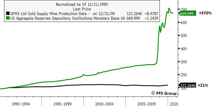
Source: Bloomberg
Conclusion #4
It is highly erroneous for anyone to [say that] gold is a bubble.
Summary
If the USD Index tracks the path of the 1970s and witnesses a sharp decline in the months and years ahead, it is likely that the ‘risk on’ trade will come back with a vengeance. This would be in a case where emerging markets would outperform the S&P 500, the S&P 500 would vastly outperform government bonds and higher yielding fixed income securities like investment grade and where high yield corporate bonds would outperform U.S. Treasuries. Commodities would rally as would commodity currencies relative to the USD, and cyclical sectors will outperform non-cyclical sectors.
For a sign that the ‘risk on’ trade is actually “on,” I would look for a decisive close of the USD Index below its 50-day moving average. However, if the USD instead stages a strong rally back above its prior broken trends, then the converse of the ‘risk on’ trade will likely be the order of the day.
Conclusion #5
My personal leaning, given the USD [Index’s] widespread weakness relative to global currencies, is an accelerated decline in the months ahead [with] precious metals being likely to be the ultimate beneficiary.
Links and titles to articles referenced above:
- What the 1970′s Performance of Gold, Silver and USD Says About Tomorrow https://munknee.com/2011/05/what-the-1970s-performance-of-gold-silver-and-usd-says-about-tomorrow/
- The U.S. Dollar Index: A Deceptive Indicator of USD Strength https://munknee.com/2010/05/the-usd-index-is-not-all-that-it-seems/
- GOLDRUNNER: Gold on Track to Reach $1860 – $1920 by Mid-Year https://munknee.com/2011/04/goldrunner-gold-on-track-to-reach-1860-1920-by-mid-year/
- The Dollar Bear Is Returning In 2011! Got Gold? https://munknee.com/2010/12/the-dollar-bear-is-returning-in-2011-got-gold/
- USD Index Drop Below 72 Will Devalue USD by 50% https://munknee.com/2010/11/u-s-dollar-collapse-is-fueling-inflation-trade-mania/
- U.S. Dollar NOT Facing Draconian Outcome Any Time Soon! Here’s Why https://munknee.com/2011/01/these-7-charts-show-underlying-future-strength-of-u-s-dollar/
- U.S. Dollar “Strength” Just a Classic “Dead Cat Bounce”: Own Any Gold Stocks Yet?https://munknee.com/2011/05/us-dollar-strength-just-a-classic-dead-cat-bounce-own-any-gold-stocks-yet/
- What’s the Difference Between 1 Gold Karat, 1 Diamond Carat and 1 Troy Ounce? https://munknee.com/2011/03/whats-the-difference-between-1-gold-karat-1-diamond-carat-and-1-troy-ounce/
- Take Note: These Analysts Believe Gold Will Go to $5,000 – or More! https://munknee.com/2011/04/take-note-these-analysts-believe-gold-will-go-to-5000-or-more/
- Why Silver at $398.52 is a Realistic Parabolic Peak Price https://munknee.com/2011/05/silver/
*http://seekingalpha.com/article/272404-gold-and-dollar-at-biggest-inflection-point-of-the-year?source=email_macro_view
Editor’s Note:
- The above article consists of reformatted edited excerpts from the original for the sake of brevity, clarity and to ensure a fast and easy read. The author’s views and conclusions are unaltered.
- Permission to reprint in whole or in part is gladly granted, provided full credit is given as per paragraph 2 above.
- Sign up to receive every article posted via Twitter, Facebook, RSS Feed or our FREE Weekly Newsletter.
USD Index