Some of the finest and most highly regarded minds in the world of PMs have been saying gold and silver are going higher…[but] the charts have “said” otherwise, and that has been the correct read…The fundamentals may be as bullish as can be [but] the charts are sending a different message.
So writes Michael Noonan (edgetraderplus.com) in edited excerpts from his original article* entitled Gold And Silver – Sticking With The Charts, From A Buddhist Perspective.
[The following article is presented by Lorimer Wilson, editor of www.munKNEE.com and the FREE Market Intelligence Report newsletter (sample here) and may have been edited ([ ]), abridged (…) and/or reformatted (some sub-titles and bold/italics emphases) for the sake of clarity and brevity to ensure a fast and easy read. This paragraph must be included in any article re-posting to avoid copyright infringement.]
Charts are infallible. Why? Because they are the market. They are the mirror of what the war between supply and demand is. They show the intervening battles between buyers and sellers, and everyone gets to see the results, as they develop, each and every day.
Left to the realities of supply/demand factors, gold and silver would be considerably higher, already. We can think of no other commodity situation with unprecedented demand and shrinking supply that has done anything else than drive price much higher. The fiat cartel, however, will not allow reality to supplant their massive wealth-transfer Ponzi scheme… This leaves us with monitoring the measure of price “reality” found in the charts…[and.] fortunately, charts are a good thing, providing a past as a guide and pointing to a likely future direction.
Charts are the distillation of all available information, including inside information, even manipulation. It is okay not to be able to understand or read them, but it is a huge mistake to dismiss them…You get a front seat on the battle line, observing first hand what is going on. Too few realize the importance of the valuable information a chart can and does convey…
If demand is greater than ever; if supply is shrinking, relative to demand, yet price is and has been moving lower, then the problem is what almost all recognize, manipulation. The charts for both gold and silver have been steadily reflecting that fact. What that fact is telling the world is that the manipulators have been in control, and still are.
If gold is to go to substantially higher price levels, it must first show an ability to rally above certain resistance levels. In large part, that has not happened. The same holds true for silver. When you read about all the reasons why both metals should be at much higher levels, weigh that information with what the charts are revealing.
Within this context, here is our read of the charts:
[As with an] ocean tide coming in or going out, as it were, you do not want to be opposing the direction (trend] of prevailing strength. In gold, the trend remains down, but evidence is building that shows there are signs of weakening.What would change the trend? A higher swing high above the August high of 1434. In a down trend, the onus is on buyers to demonstrate a change in market behavior, and this is one of the measures.
If you notice [in the chart below] the bars since the August swing high have remained relatively large and overlapping at the same time[conveying that]…buyers have been more active and responsive to selling activity. The proof of that comes from the outcome: a newly established swing low. Price closed at the highest weekly level since the opening week of September. This is a red flag for the bears.
Gold – Weekly Chart

Gold – Daily Chart
Weekly charts are not used for timing. We need to look at a daily chart for more detail.
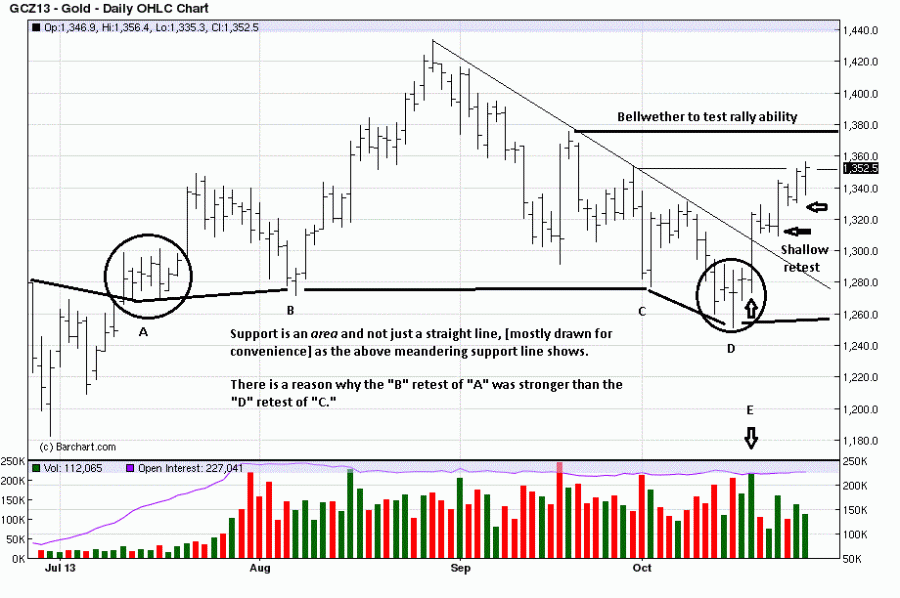
“A” – On the left side of the chart above there is a clustering of closes at “A.” A clustering can lead to a brief pause before resuming the previous trend, (down, in this case), or it can lead to change, as it did here.
After the strong rally bar and swing high, just above 1340, the character of the ensuing correction was labored, taking 11 trading days to retrace a five-day rally. This is a clear message from the market, for anyone to see, although not everyone does despite it being there.
“B” – The retest correction ends at “B,” and another higher rally follows. What we can now see are two points of support for future reference.
“C” – After that rally, another correction developed, and its decline stopped at “C,” the same price level as “A” and “B.” In knowing the past, the market was providing important information in the then present, at “C.”
“D” – We see the rally that followed “C” was weak, and from that, we could expect either another retest, or even a stronger trend lower. Another clustering of closes and overlapping bars developed at “D,” slightly lower than “C,” but still in a support area, which we know from knowledge of the past.
The difference between the stronger quality retest at “B” versus the weaker retest at “D” comes from knowing the trend. At “B,” we were seeing the early stages of a trend higher. At “D,” price has obviously been trending lower, and it takes more effort to stop and reverse a down trend.
What we continue to know from the past is even though retest “D” may have been lower than “C,” it is still at previous support “A” and “B.” We comment that support is an area and not a single straight line or single price level. One has to be more flexible.
“E” – Would the “D” cluster be a pause, or would it reverse the down trend, while at support? The answer came on 17 October when price rallied higher on a wide range bar and also on increased volume, “E.” At the same time, the trend line off the August high was broken.
After the rally at “E,” the market provided more important information in the 3 day correction sideways, a rally ensuing on the third day. Note how little price corrected over that 3 day span. Weak corrections lead to higher prices, and the market’s message did not disappoint.
After the next rally, the 4th bar from the right, there was only a one day correction, and price began to resume its current move higher. So far, the lack of a downside counter move has been a sign of strength, and price may be absorbing at the minor failed high resistance at the end of September.
The more important resistance level, at least on the daily, is just under 1380. How price gets there and how it reacts to that potential resistance level will provide additional market feedback that will reveal the character of the trend at that point.
The point is to use a chart to provide a context for viewing fundamental considerations. The futures are now providing reason to be trading from the long side, that is, the paper market. The other known fundamental factors have already been screaming for purchases of the physical metal, without any question.
Silver – Weekly Chart
The weekly chart below shows the labored decline in silver stopped at the August gap breakout, (a support point), and a higher swing low was created, a necessary first step in a change of trend. We are being educated about the nature and character of the market via the chart pattern behavior and it is telling us silver is having an easier time going up, and a harder time declining.

Silver – Daily Chart
Similar to the daily gold analysis but sharper in subsequent support areas, silver has also been sending a message of change. There were two consecutive labored corrections after a rally, and both are signs of buyers being more in control over sellers who are having more difficulty moving price lower. In a down trend, sellers should be in greater control and be able to move the market more readily.

As can be seen in the chart above, the two failed retests stopped at previous support. By taking that knowledge of the past and applying it to the present, we are positioned to make a more informed decision about the future…We can say for certain is that the trend has weakened, but it has not ended. Still, we are being given clues on how to participate from the long side, using close stops. The last 4 trading days appear to be absorbing the effort of the sellers. If that is the case, expect to see higher prices next week.
The fundamentals may be as bullish as can be. The charts are sending a different message, and that has been the case since the 2011 highs.
[Editor’s Note: The author’s views and conclusions in the above article are unaltered and no personal comments have been included to maintain the integrity of the original post. Furthermore, the views, conclusions and any recommendations offered in this article are not to be construed as an endorsement of such by the editor.]
*http://edgetraderplus.com/market-commentaries/gold-and-silver-sticking-with-the-charts-from-a-buddhist-perspective
Recent Noonan Articles:
1. Noonan: Is Gold’s Decline Being Caused By Fed Payback Time to China?

The manipulated raids in the gold market since last April may be hurting the Precious Metals game players, weakening their confidence and “disproving” gold’s worth against a fiat currency, but they serve a greater purpose, as in Federal Reserve payback time to China. Here’s why. Read More »
2. Noonan: The Fed Will Never Ever Taper & What That Means For Gold

The Ponzi bubble is bigger than most can imagine. Western central planners… [continue to try to] suppress gold and silver in order to keep their sorry lives alive. In the process, the destruction of people’s financial well- being is unabated… Read More »
3. Noonan: Gold & Silver Could Move Sideways for Another 1-2 Years – Here’s Why

Using past history of how price responds, it is likely that gold, and silver, could move sideways for another year or two. While this flies in the face of so many current, supposedly “expert”, opinions [mine is not based on opinion but, rather, is strictly based on the facts as conveyed by the charts. Take a look and you will see that too!] Read More »
4. Noonan: These Charts Clearly Show What’s Happening With Gold & Silver – Take a Look

Below is a perfect example of how the charts timed the movement in the price of gold and silver over the past week. Yes, you CAN time the market as this article clearly demonstrates! When the market “talks,” we listen.] Read More »
The window of opportunity to buy physical gold and silver continues to narrow. Like the housing market top was known to be coming, when it came, those who waited too long regretted it. When the bottom for the physical PMs is known as a certainty, those who waited for a “better price” may also regret that decision. It is all about choice. Read More »
In an election, it does not matter if voter turnout is high or low, the outcome is determined by the actual votes cast. The same holds true for the markets. Only those who make an actual buy or sell decision determine the outcome of the market trend. The market “voters” turn up in charts, recorded in the price range, close, and volume. Collectively, a “story” unfolds, and it usually is an accurate one as it does not include any opinions. Opinions do not matter. Articles written about fundamentals, pundit declarations, etc., all fall under the category of opinions. The market is the best source for information, and that is a fact. Read More »
…Fiats have an unbroken track record of failing throughout all of history. Gold also has an unbroken track record of being a store of value for over 5,000 years. Yes, there have been hiccups along the way, and we are in one now. It is what it is, but what it is is also an incredible buying opportunity at “fire sale” prices….[That being said,] a look at the charts of the paper-tracked PM market [beg the question] … “Where’s the beef?” Where is the substance of anything? We see none in the charts. Take a look. Words: 610; Charts :4 Read More »

Technical analysis is a measure different from fundamental analysis…and we qualifying our approach with a specialized subset of technical analysis. How so? We read price and volume behavior, over time, in the form of developing market activity. It is what one sees on a chart, price ranges, close locations, volume, time factor[s], but no more. Below are charts that suggest that the weakness in silver may be coming to an end, sooner now rather than later, but that for now, it is what it is – and what is, is reality. Read More »

You will read more and more articles touting how gold and silver have bottomed. They have not, at least according to price behavior as determined by actual buyers and sellers in the market. Read More »
Charts speak the loudest…and they never lie…[because they are] the true record of all buy and sell decisions executed, coming from the most informed to the least informed. Most of the problems lie with those who form an opinion, and how they choose to impose it onto what any given chart “says.” My understanding of what the quarterly monthly, weekly and daily charts are conveying about the price action of silver is, simply,] “Silver stackers, these lower prices are a gift you should keep on taking. Stay tuned.” Read More »
If you want to make rabbit stew, first, you have to catch the rabbit so hopefully, first, we’ll see some concrete signs that a bottom is in before the regurgitation of “Gold is going to $10,000!” starts showing up in a host of new articles pandering for attention. The best way is to decide for yourself…so let us go to the most reliable source, the market, and see what the prices of gold and silver have to say about what everyone else has been saying about them. People have been known to exaggerate, even lie in their “opinions,” but the market never does either. Read More »
Not one Precious Metals guru has gotten anything right in the last 18 months. All have been calling for considerably higher prices. Over the past several months none called for sub-$1,300 gold and sub-$20 silver. Crystal balls do not work and never have. When it comes to markets, anything can happen [but the charts convey that] there is no apparent ending action suggesting a selling climax or even a cause for a reaction rally. Take a look. Read More »