With QE now winding down, the economy facing reduced headwinds, and risk aversion beginning to decline, risk taking is beginning to increase and that is an essential ingredient for healthier economic growth.
The above introductory comments are edited excerpts from an article* by Scott Grannis (scottgrannis.blogspot.ca) entitled Good news: risk aversion is declining.
The following article is presented courtesy of
Lorimer Wilson, editor of
www.munKNEE.com (Your Key to Making Money!), and
www.FinancialArticleSummariesToday.com (A site for sore eyes and inquisitive minds) and has been edited, abridged and/or reformatted (some sub-titles and bold/italics emphases) for the sake of clarity and brevity to ensure a fast and easy read. This paragraph must be included in any article re-posting to avoid copyright infringement.
Click on Facebook for latest articles on gold/silver & economic/financial matters
Click on Twitter for latest tweets
Click here to subscribe to our FREE Market Intelligence Report (sample here)
Grannis goes on to say in further edited excerpts:
The recovery from the Great Recession of 2008-09 has been the weakest ever, and that has a lot to do with the fact that this has also been the most risk-averse recovery ever.
- Households have deleveraged like never before;
- the world has stocked up on cash and cash equivalents like never before;
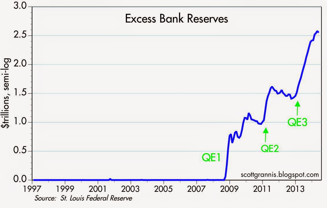
- banks have accumulated trillions of dollars of excess reserves; and
- business investment has been exceptionally weak despite record-setting profits.
Contrary to popular perception, the above facts suggest that the real function and purpose of the Fed’s Quantitative Easing program was to satisfy the world’s voracious appetite for risk-free, safe assets, which in turn was a by-product of the scariest recession ever. The reason QE has not boosted the economy is because QE has only served to treat the symptoms of risk aversion that have held the economy back. With QE now winding down, and risk aversion beginning to decline, the economy is facing reduced headwinds and growth could therefore begin to pick up.
Why so much risk aversion? There are undoubtedly lots of reasons, but the obvious ones are:
- the profound shock that accompanied the Great Recession, as the global economy and financial markets teetered on the brink of disaster;
- the great uncertainty that has accompanied the Fed’s unprecedented foray into Quantitative Easing (you can see that uncertainty reflected in the surge in the price of gold to $1900/oz.);
- the increased regulatory burdens imposed by Dodd-Frank and Obamacare; and
- the trillion-dollar deficits that arose from a massive increase in government spending in 2008 and 2009.
Many of these problems are still with us, but they are fading.
- The federal deficit has plunged by fully two-thirds, to only $490 billion in the 12 months ending last May.
- The Fed is tapering QE and should finish within a matter of months.
- Obamacare is slowly but surely imploding, and market-based reforms are the only viable and sensible solution.
- Global equity market capitalization has reached new highs, and this surely reflects at least a decline in pessimism if not the return of some optimism.
- Swap spreads in most major markets are at very low levels, suggesting an almost complete absence of systemic risk.
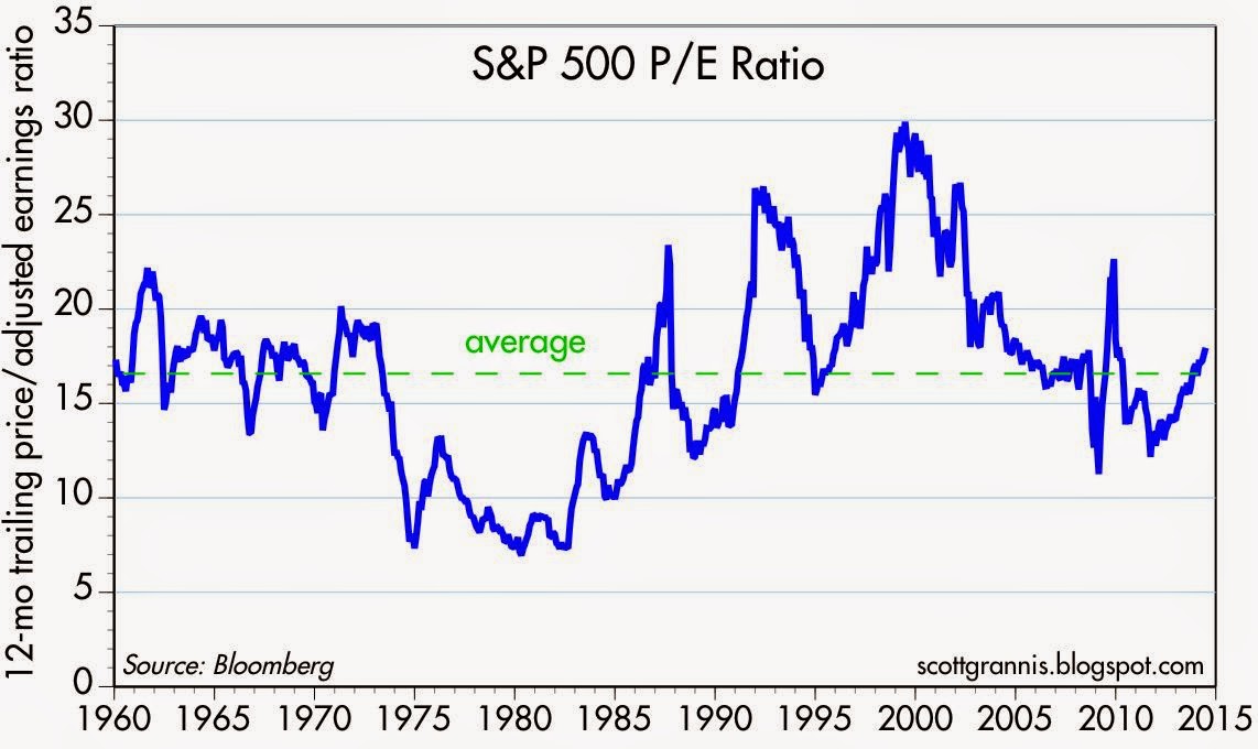
- PE ratios are now at above-average levels.
As risk aversion declines, risk taking increases, and that is an essential ingredient for healthier economic growth.
U.S. Households’ Leverage
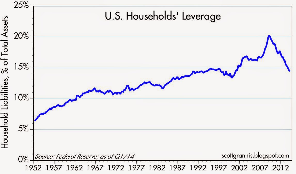
The chart below shows the leverage of the household sector, which I’ve calculated using the Fed’s Flow of Funds data through Q1/14. Total liabilities as a % of assets have fallen by almost 30% in the past five years years, taking household leverage back to levels last seen in the early 1990s. In the past 70 years there has never been such a dramatic deleveraging of household balance sheets. This has come about as a result of an unprecedented five-year decline in total liabilities (from a high of $14.6 trillion to $13.8 trillion), and a five-year rise in total assets (financial assets rose by $21.4 trillion and real estate values increased by $4.1 trillion).
U.S. Households’ Financial Burdens
The chart below shows another way of looking at households’ leverage. It compares monthly debt service and financial obligation payments to disposable income. By this measure, households currently have the lowest financial burdens in the past 30 years. We’ve never before seen such a significant decline in financial burdens. Households have seriously hunkered down, which is not surprising given the unprecedented financial and economic turmoil unleashed in the Great Recession. Once burned, twice shy, as they say. Of note, however, is the fact that financial burdens are relatively unchanged over the past year, which in turn suggests that households’ deleveraging is nearly complete. Risk aversion, by this measure, may have run its course.
Consumer Loan Delinquency Rates
The pronounced deleveraging of the household sector has predictably resulted in a huge improvement in households’ financial health. The chart below shows the average delinquency rate on credit cards and all consumer loans as of Q1/14. Both of these measures of the health of household finances have fallen dramatically since the Great Recession, to the lowest level in decades.
Credit Card Debt Outstanding
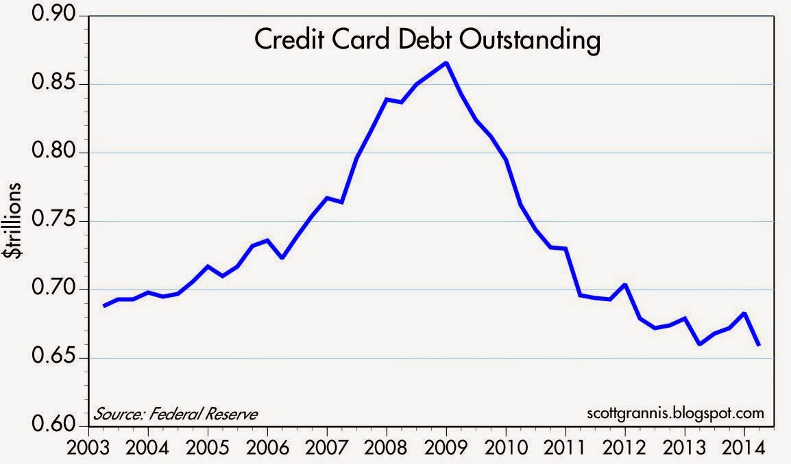
As the chart below shows, credit card debt outstanding has plunged by almost 25% since late 2008. Banks’ profit margins are up, thanks to more responsible risk-taking on the part of both banks and households.
Adjusted Bank Reserves
Since late 2008, the Fed has pumped up the supply of bank reserves by over $2.6 trillion through its purchases of Treasuries and MBS. About 94% of those additional reserves currently are held by banks in the form of “excess reserves.” [see second chart]… Banks have essentially used strong inflows of savings deposits to purchase bonds, then sold those bonds to the Fed in exchange for reserves which they were content to hold. Banks have in a sense been “investing” their deposit inflows in bank reserves, which are functionally equivalent to T-bills.
The public’s demand for the safety of savings deposits (which carry a government guarantee but yield almost nothing) has been very strong, and banks’ demand for reserves (which have an implicit government guarantee and pay almost nothing) has also been very strong, and both reflect lots of risk aversion.
The Fed’s massive purchases of bonds have only served to satisfy the world’s massively increased demand for safe, risk-free assets.
The world’s demand for money has been extraordinarily strong, and that explains why bank lending has been relatively weak. (Strong demand for money is the opposite of strong demand for credit; significant increases in bank lending reflect a declining demand for money.)
Total Bank Credit
As the chart below shows, bank credit has expanded at a very slow rate since late 2008, even as banks’ ability to make new loans has become virtually unlimited as a consequence of the Fed’s prolific supply of bank reserves. This can only mean that:
- banks have tightened their lending standards, and/or
- businesses and households have been reluctant to take on more debt, preferring instead to deleverage.
No matter how you look at it, this is powerful evidence of risk aversion across the entire economy. I would note, however, that bank credit has been accelerating of late: total bank credit grew only 1.2% last year, but grew at an 8% annualized rate in the first six months of this year. This is a good sign that risk aversion is beginning to decline, to be replaced by more risk taking. On the margin, banks are more willing to lend, and households and businesses are more willing to borrow, and this points to less risk aversion, more confidence, and more investment in the future.
U.S. Savings Deposits
As the chart below shows, savings deposits at U.S. banks have soared by over $3 trillion since late 2008. Banks have been the recipients of a virtual flood of new savings deposits from consumers and businesses, even though the interest rate on those deposits has been the lowest in modern banking history. Meanwhile, banks have been content to hand over almost all of their deposit inflows to the Fed in exchange for risk-free bank reserves that pay only 0.25%.

Most of the increase in the M2 measure of the money supply since the onset of the 2008 financial panic has come from a $3.4 trillion increase in bank savings deposits. There’s also been a substantial increase in currency in circulation, which has been driven in large part by strong overseas demand for U.S. currency. Both of those are symptomatic of very strong money demand: the world has been pouring money into bank savings deposits despite extremely low interest rates, and the world has been craving U.S. dollar cash, even though it pays no interest at all and has been losing about 2% of its purchasing power every year.
Money Demand
Think of M2 has a handy measure of the economy’s cash on hand—readily available, spendable cash. Think of nominal GDP as a proxy for the economy’s annual income. The ratio of the two, shown in the chart below, is similar to the percentage of the average person’s income that he or she wants to hold in cash or cash equivalents (checking accounts and savings deposits).
The demand for cash relative to incomes has never been higher than it is today, and it has risen by about 30% since the onset of the 2008 financial crisis. The world has been stockpiling liquidity instead of spending it. The Fed’s expansion of the money supply has only accommodated an increased demand for that money; that’s why it hasn’t been inflationary. This should soon start to reverse if the other indicators mentioned above are any guide.
Corporate Profits vs. GDP
The two charts below illustrate just how risk-averse the corporate sector has been in this recovery. The first chart shows that after-tax corporate profits have tripled since the end of 2000, and have increased by much more than nominal GDP yet, as the second chart shows, capital goods orders—a good proxy for business investment—are only moderately higher today than they were prior to the 2001 recession, and are still significantly lower in real terms. We see the same story with private sector jobs, which today are only about 1% above their pre-recession high. Businesses have been extremely reluctant to reinvest their soaring profits.
S&P 500 P/E Ratio
For their part,
investors only recently have been willing to pay above-average multiples to own equities, despite record levels of profitability, record-low interest rates, and an expanding economy, as the chart below shows.
Conclusion
Everyone has been very risk averse, but risk aversion is declining, and the outlook is therefore likely to improve in the months and years to come.
Editor’s Note: The author’s views and conclusions in the above article are unaltered and no personal comments have been included to maintain the integrity of the original post. Furthermore, the views, conclusions and any recommendations offered in this article are not to be construed as an endorsement of such by the editor.
*http://scottgrannis.blogspot.ca/2014/07/good-news-risk-aversion-is-declining.html
Related Articles:
1. Believe It or Not: Both Bulls & Bears Playing In Current Market
The current U.S. equity market has something for everyone. Whether you are bullish or bearish, there is no shortage of indicators or charts you can use to support your thesis. Read More »
2. Are We In Phase 3 – the Final Phase – of This Bull Market Yet?
Are we in the third phase of a bull market? Most who will read this article will immediately say “no” but isn’t that what was always believed during the “mania” phase of every previous bull market cycle? With the current bull market now stretching into its sixth year; it seems appropriate to review the three very distinct phases of historical bull market cycles. Read More »
3. Relax! The Stock Market Is Anything But “Scary-Overvalued” – Here’s Why
Are we near the end of one of history’s great stock market rallies? I don’t think so. Yes, prices are in the upper half of their long-term trends, but it’s not what you might call “scary-overvalued.” There is still plenty of room on the upside before historical precedents are violated. Let me explain further. Read More »
4. Is Now the Calm Before the Storm?
I’d argue that the record low volume shows investors aren’t looking ahead as much as looking behind and reminiscing at how good things have been over the past five years or so. They’re expecting more of the same even though it’s mathematically impossible people. Read More »
 taking is beginning to increase and that is an essential ingredient for healthier economic growth.
 munKNEE.com Your Key to Making Money
