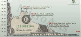
You’ve almost certainly seen the chart below over the years – it shows the purchasing power of the US Dollar over time - and it looks terrifying. I call it the "stupid" chart, though, because it is a total misrepresentation of the facts because it isn't telling the full story. Here's why.
Read More »This is the Most “Stupid” USD Chart Around – Here’s Why (+2K Views)