The following 7 gold ratio charts show you what to look for in regards to seeing confirmation that a new bull market is truly underway. [Keep in mind that] correlations are never perfect but it is the general trend we want to focus in on…[and this article helps one focus on doing just that].
(Please note: Lorimer Wilson, editor of munKNEE.com (Your KEY To Making Money!), has edited* ([ ]) and abridged (…) the original article here for clarity and brevity to ensure a fast & easy read. Also note that this complete paragraph must be included in any re-posting to avoid copyright infringement.)
…[Looking at a variety of] ratio charts…is like putting the pieces of a puzzle together where the small pieces don’t look like much by themselves but when they’re all added together it paints a clear picture. These ratio combo charts are just a piece of the puzzle that may add some clarity to some of the individual sectors.
1. The TIP:TLT ratio chart
…Are we in an inflationary or deflationary cycle?…I use the TIP:TLC ratio chart for the inflation/deflation debate. When the ratio in black is rising it shows signs of inflation and when it’s falling deflation becomes possible. (Also at the bottom of the chart the GDX and the CRB index have been added with the 30 week ema.)
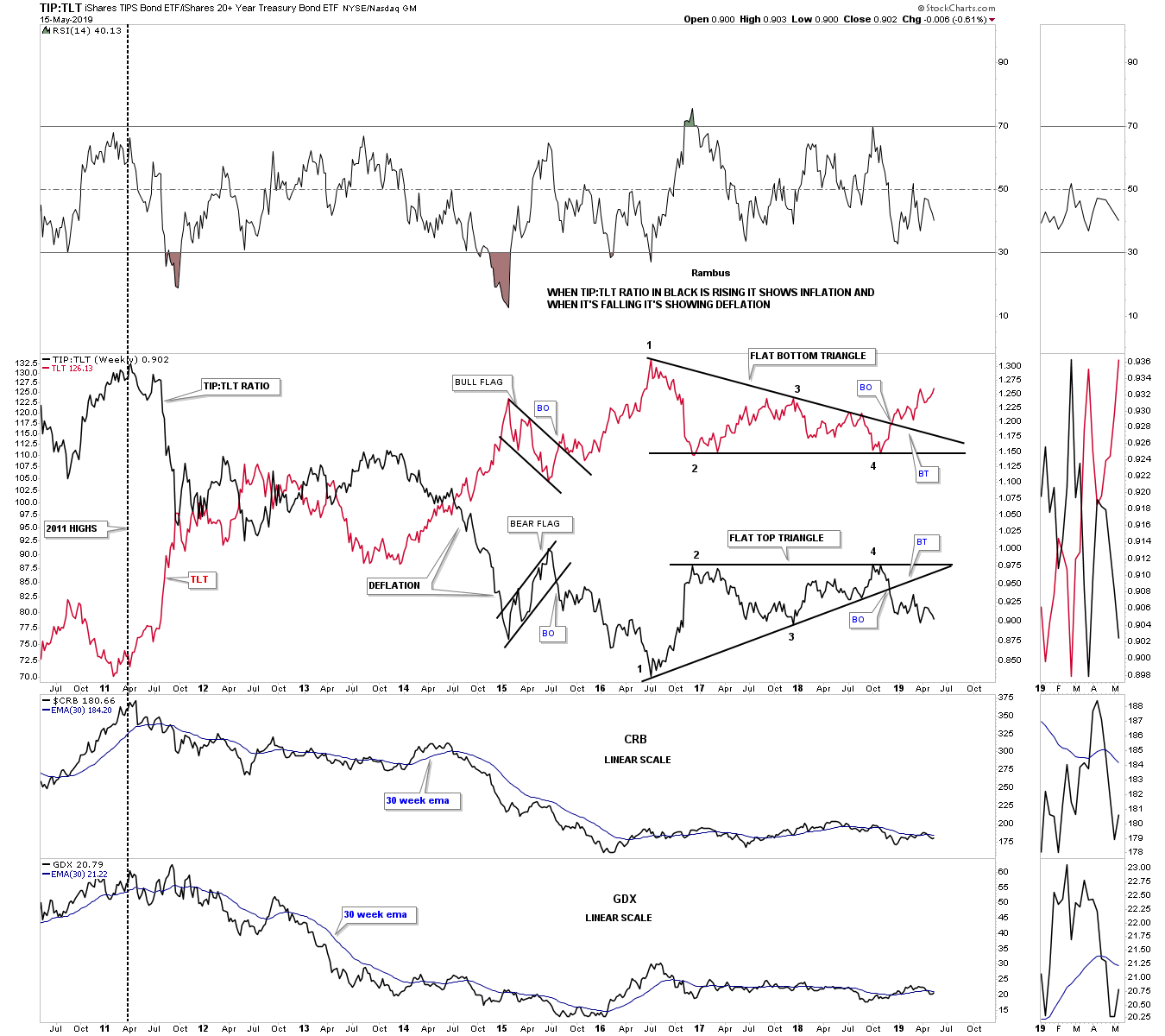
- Since the 2011 high the main trend has been down for the ratio chart in black which shows deflation. In July of 2016 both the ratio and the TLT topped out beginning a consolidation phase that would last for about 2 1/2 years with each forming a triangle consolidation pattern.
- In November of 2018 both broke out of their respective triangles signaling that we may see some deflation in our future.
- At the bottom of the chart you can see the CRB index along with the GDX are currently trading below their 30 week ema which is not the end of the world but short term negative.
The bottom line is that as long as the ratio in black keeps falling the odds favor a possible deflationary event maybe in the cards in the future.
2. The TLT:GLD ratio chart
This next ratio combo chart has the TLT:GLD ratio on top with GLD on the bottom…When the ratio chart on top is rising it generally means GLD is falling.
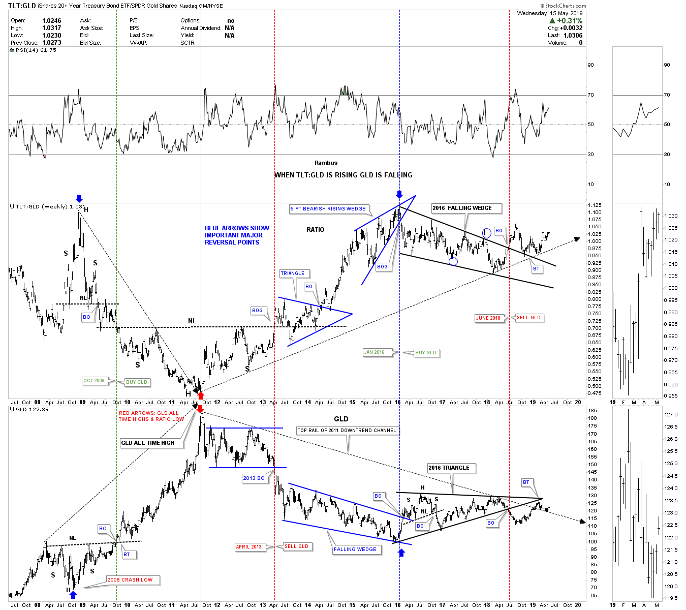
- During the 2008 crash in GLD the ratio was topping while GLD was bottoming.
- Then in 2011 GLD was topping while the ratio was bottoming as shown by the red arrows.
- From that point in 2011 the ratio has been rising while GLD has been declining.
- In June of 2018 the ratio broke out above the top rail of its 2016 falling wedge formation while GLD broke below the bottom rail of its 2016 triangle which was technically a sell signal for GLD.
- The thin black dashed arrow starting in 2011 shows the uptrend for the ratio and the downtrend for GLD. There is a bit of an aberration taking place currently where GLD is trading right on its 2011 downtrend line while the ratio is trading significantly above its 2011 uptrend line. It will be interesting to see how this divergent plays out in the coming weeks and months.
…The 2016 bearish rising wedge led to the rally phase in GLD when the bottom rail was broken to the downside. That was one of our clues to get long the PM stocks back in January of 2016 which ended up being a short lived buy signal of only eight months, no big trend change.
3. A GDX & $BPGDM combo chart
This next ratio combo chart has the GDX on the top with the BPGDM on the bottom. Buy signals are given when the price action is above the 5 day sma and the 5 day sma is above the 8 day sma and just the opposite for a sell signal. The $BPGDM is currently on a sell signal.
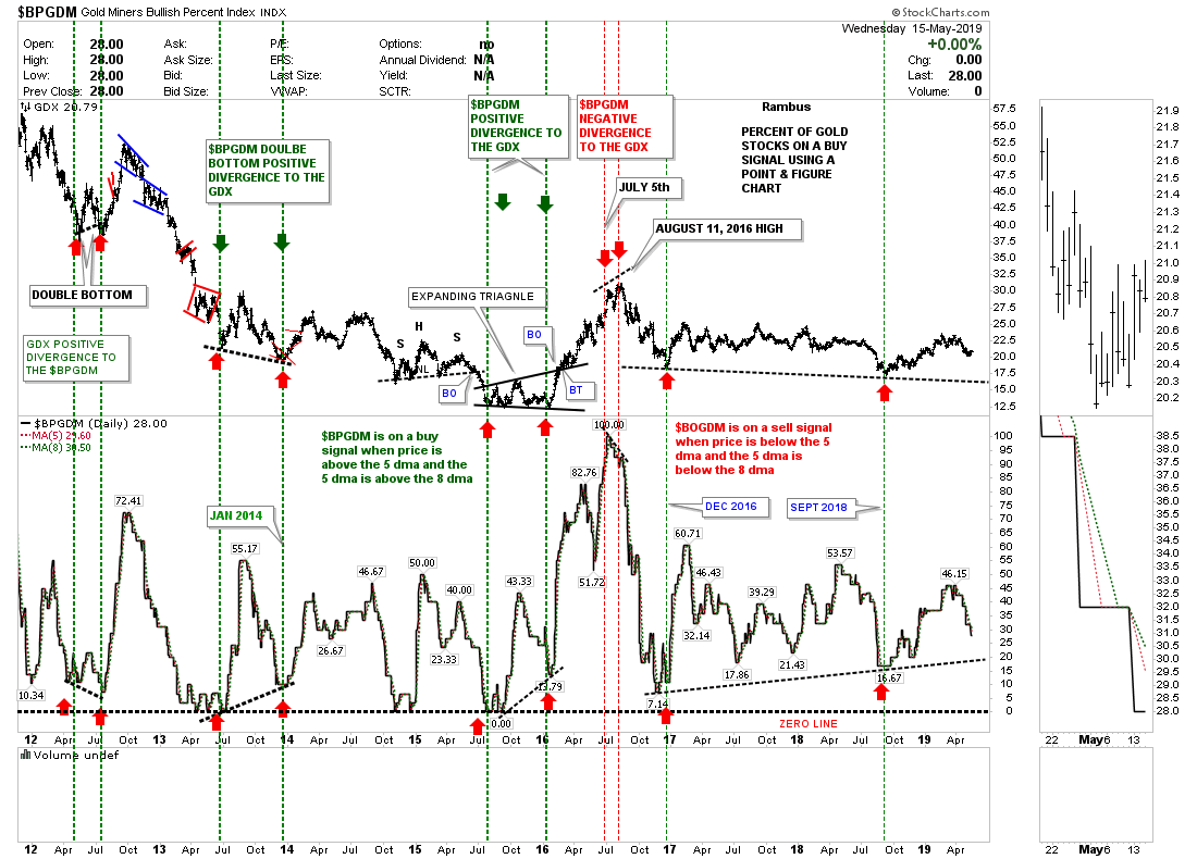
There is another way I like to use this combo chart and that is to look for either a positive or negative divergence between the GDX and the $BPGDM as shown by the red arrows. Note the negative divergence at the 2016 high for the GDX vs the $BPGDM which was another signal I used to help get me out of the PM stocks before too much damage was done. It’s possible we could be seeing a positive divergence taking place between the GDX and the $BPGDM since the December 2016 low. As you can see:
- the GDX has made a lower low vs the $BPGDM in September of 2018 as shown by the red arrows.
- If both the GDX and the $BPGDM touch their respective trendiness at the same time there will be more PM stocks on a point and figure buy signal vs the 2016 and 2018 lows while the GDX is making a lower low. This would support a bullish setup for the PM stocks.
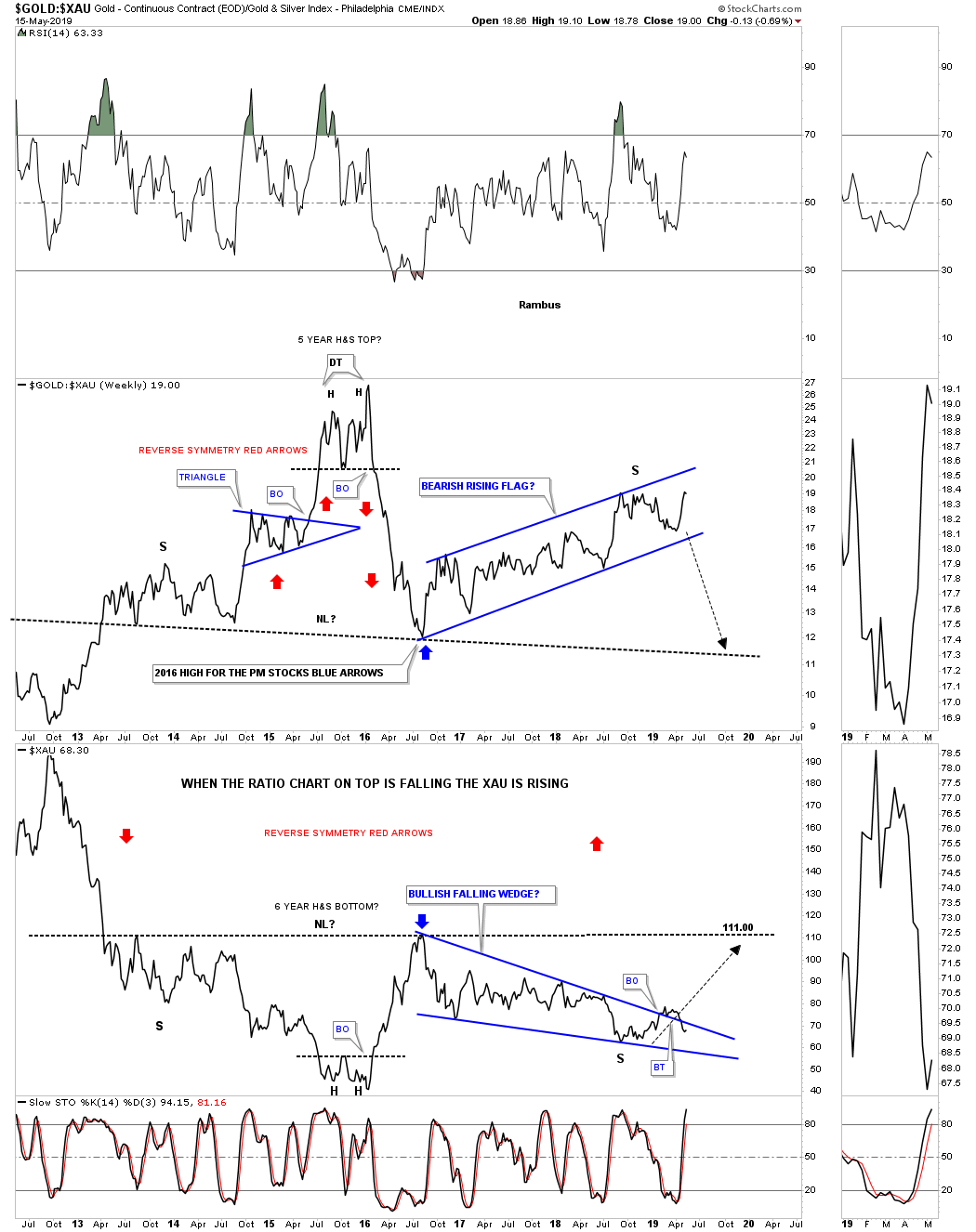
4. The GOLD:XAU ratio
This next ratio combo chart…has the GOLD:XAU ratio on top with the XAU on the bottom…
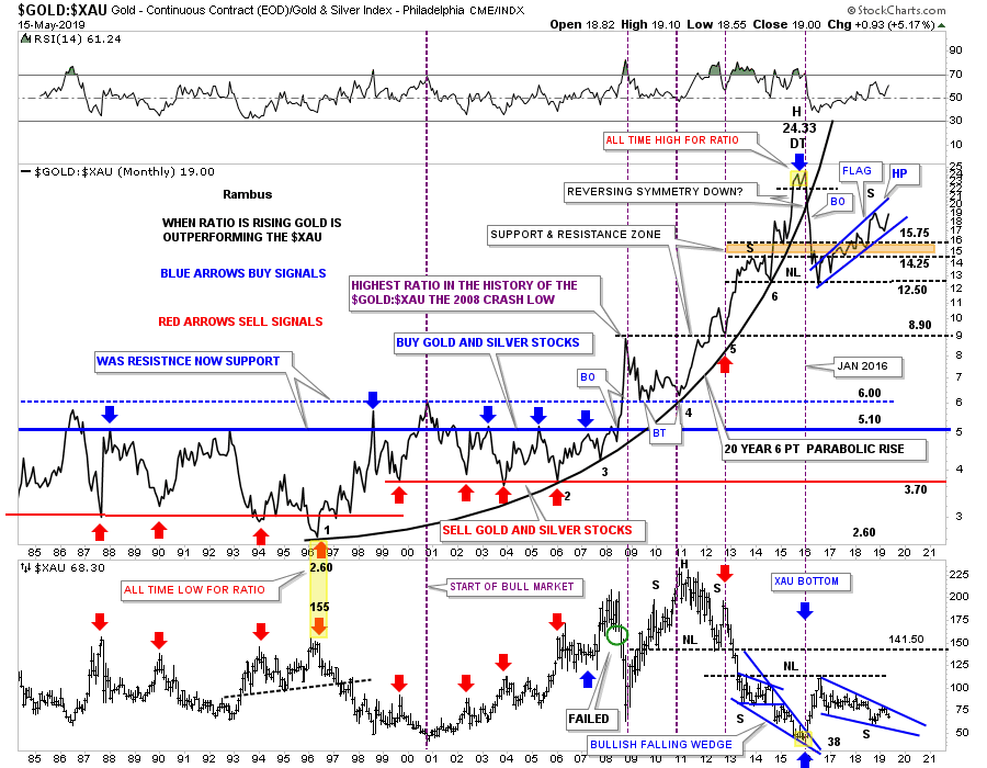
Instead of building out a H&S top the ratio has been building out the blue rising flag formation which is not what the PM bulls want to see. That in turn is causing the XAU to decline in its 2016 falling wedge formation. The bottom line is that a break below the bottom rail on the ratio chart on top, would be very constructive for the XAU and PM stocks in general. Until then the better part of valor is to stay on the sidelines.
5. A short-term Gold:XAU combo chart
Below is a shorter term weekly combo chart for the combo ratio chart above which brings into focus the last six years or so of price action. Again, what we want to see is for the ratio chart on top to break below the bottom rail of its rising flag formation which in turn will cause the XAU to rally.
6. A 50 year GOLD:SPX ratio chart
The ratio chart below compares GOLD to the SPX going back 50 years. When the ratio is falling GOLD is in a bear market vs the SPX and vise versa. As you can see the big trends can last a very long time before a reversal is seen. As long as the price action trades below the 200 week sma GOLD is in a bear market vs the SPX.
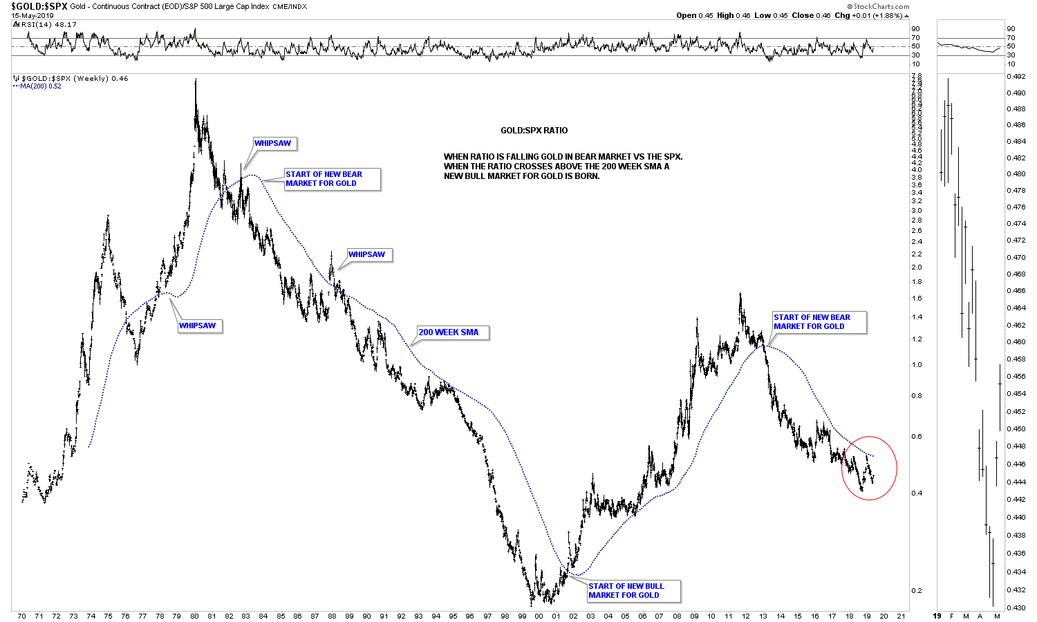
7. A 15 year GOLD:SPX ratio chart
Below is just a 15 year weekly chart for the GOLD:SPX ratio along with its 200 week sma, which shows just one sell signal for gold vs the SPX in 2013. Earlier this year the ratio made it almost all the way up to the 200 week sma but turned down before breaking out. A breakout above the 200 week sma would be a very bullish development for gold and the PM complex in general.

Conclusion
…The charts above show you what to look for in regards to seeing confirmation that a new bull market in PM complex is truly underway.
(*The author’s views and conclusions are unaltered and no personal comments have been included to maintain the integrity of the original article. Furthermore, the views, conclusions and any recommendations offered in this article are not to be construed as an endorsement of such by the editor.)