The Q Ratio, the total price of the market divided by the replacement cost of all its companies, is a popular method of estimating the fair value of the stock market…[and it shows that the stock market is overvalued by 50% compared to its arithmetic mean and by 62% compared to its geometric mean. This article explains the Q Ratio more fully complete with illustrative charts.]
Extrapolating Q
Unfortunately, the Q Ratio isn’t a very timely metric. The Z.1 data, supplied by the Federal Reserve Financial Accounts, is over two months old when it’s released, and three additional months will pass before the next release. To address this problem, our monthly updates include an estimate for the more recent months based on changes in the VTI price (the Vanguard Total Market ETF) as a surrogate for Corporate Equities; Liability.
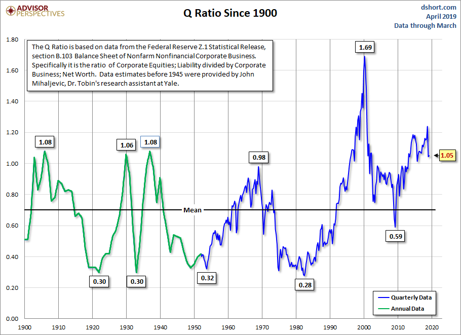
The first chart shows Q Ratio from 1900 to the present. …The average (arithmetic mean) Q Ratio is about 0.70.
Interpreting the Ratio
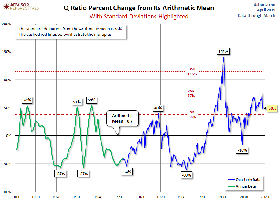
The chart below shows the Q Ratio relative to its arithmetic mean of 1 (the ratio data points divided by the average). This gives a more intuitive sense to the numbers. For example, the all-time Q Ratio high at the peak of the Tech Bubble was 1.61 — which suggests that the market price was 136% above the historic average of replacement cost. The all-time lows in 1921, 1932 and 1982 were around 0.30, which is approximately 55% below replacement cost. That’s quite a range.
The latest data point is 50% above its arithmetic mean.
Another Means to an End
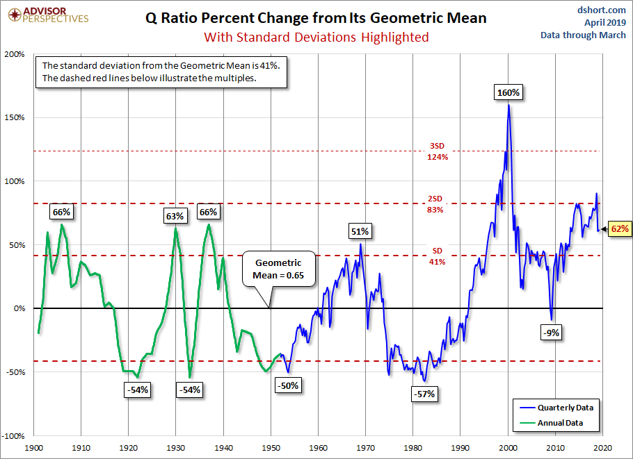
…The chart below is adjusted to the geometric mean, which, based on the same data as the two charts above, is 62%.
The Message of Q: Overvaluation
…Periods of over- and under-valuation can last for many years at a time, so the Q Ratio is not a useful indicator for short-term investment timelines. This metric is more appropriate for formulating expectations for long-term market performance.
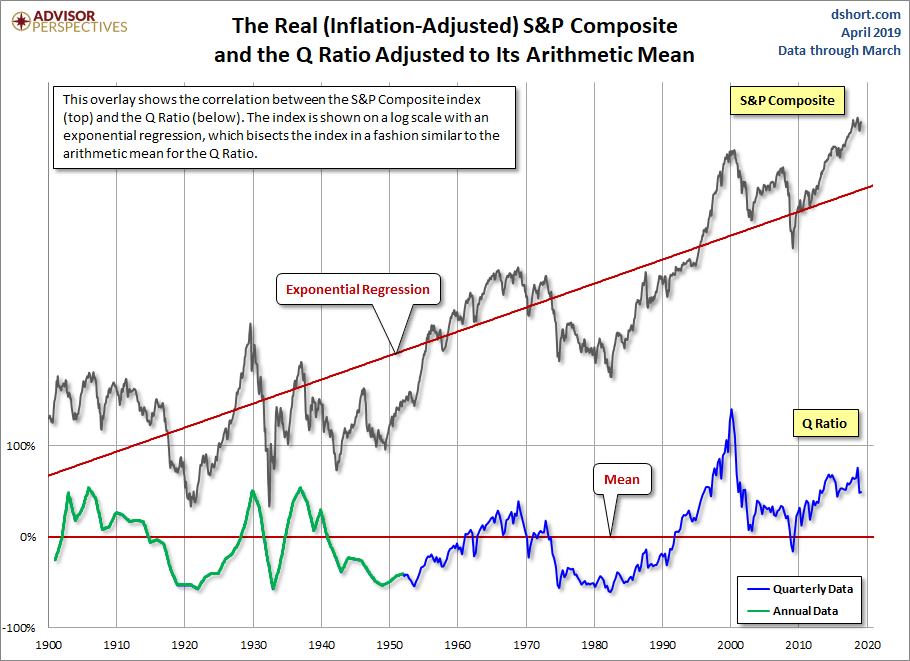
As we can see in the next chart, peaks in the Q Ratio are correlated with secular market tops, the Tech Bubble peak being an extreme outlier.
For a quick look at the two components of the Q Ratio calculation, here is an overlay of the two since the inception of quarterly Z.1 updates in 1952…
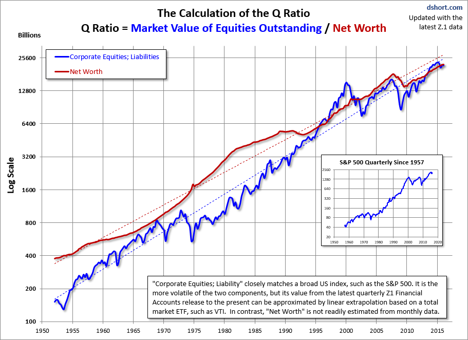
The regressions through the two data series…help to illustrate the secular trend toward higher valuations.