…The World Inequality Report 2018 is a rich resource, with lots of information on inequality of incomes by country and by region, inequality of wealth, shifts in public wealth, and other topics. Here are a few of the figures that jumped out at me.
The original article by Timothy Taylor has been edited here for length (…) and clarity ([ ]) by munKNEE.com to provide a fast & easy read.
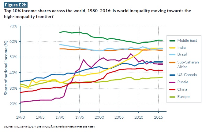
…[The graph below] shows the share of income going to the top 10% of the income distribution in a number in some prominent countries and regions.
- Inequality in the US-Canada area (blue line) is clearly rising, but so is inequality across all of these areas.
- In particular, economic development in China and India has made some parts of those economies much better-off than others, so inequality his on the rise.
- The rise of inequality in Russia during the 1990s is also apparent.

…[In the] graph [below]…you can see [that] inequality in the Middle East, sub-Saharan Africa, and Brazil have long been above US-Canada levels, and by this measure, India has now passed the US level of inequality.
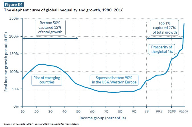
As the text explains:
- “On the horizontal axis, the world population is divided into a hundred groups of equal population size and sorted in ascending order from left to right, according to each group’s income level. The Top 1% group is divided into ten groups, the richest of these groups is also divided into ten groups, and the very top group is again divided into ten groups of equal population size.
- The vertical axis shows the total income growth of an average individual in each group between 1980 and 2016.”
For example, the figure shows that:
- an adult who was in the 20th percentile of the world income distribution in 2016 had an income that was about 120% higher than an adult who was in the 20th percentile of the world income distribution in 1980.
- The “head” of the elephant shows that the gains to those in the 20-40th percentiles of the world income distribution were substantial.
- The drop in the middle shows that gains were smaller for those from the 50th-80th percentiles of the world income distribution.
- On the far right, the top percentile is divided up into smaller slices.
- The gains for the top percentile were substantial but comparable to those in the 20th-40th percentile.
- However, the gains the top 0.01% and the 0.001% were substantially larger…
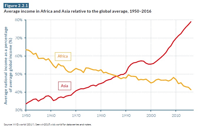
Underlying these overall patterns are some shifts in regional economic patterns that are fairly well-known, but remain striking…[The graph below] looks at average incomes in Africa and across Asia, and how they compare to the average world income.
- In 1950, Africa was well ahead of Asia relative to average world income, but that pattern has dramatically reversed.
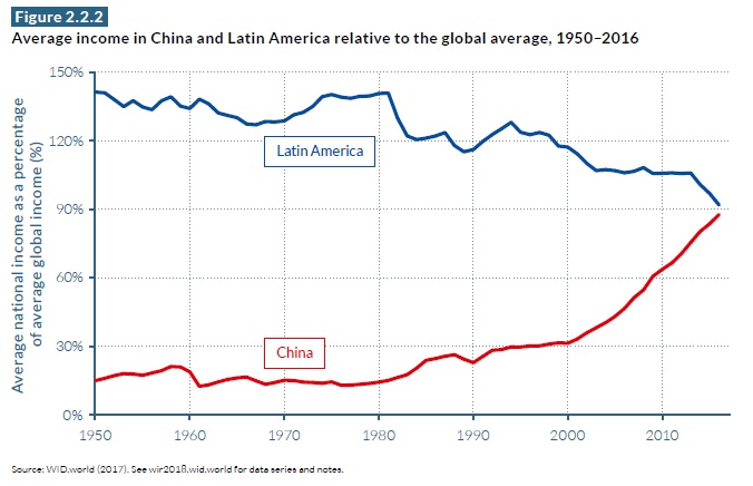
…China lagged far behind Latin America relative to world income back in 1950 but Latin America has underperformed the world economy, and China has outperformed it, and China appears to be on its way to outstripping Latin America in average incomes in the next few years.
The World Inequality Report 2018… is a rich resource, with lots of information on inequality of incomes by country and by region, inequality of wealth, shifts in public wealth, and other topics. The policy discussion is relatively brief (better education, progressive taxation, rethinking labor institutions), but that was fine with me. The fundamental point of this exercise is to generate a common fact base, and then let the policy discussion build upon it.
Related Articles From the munKNEE Vault:
1. Oxfam: Economic Inequality Is Still Rising – Here Are 7 Major Reasons Why
As the global elite descend upon Davos for the World Economic Forum to rub elbows, Oxfam has released a report…showing that 8 men own as much as the poorest half of the planet. Those 8 individuals are:
2. New Report Confirms that “Occupy Wall Street” Has a Point Regarding Income Inequality in America
Of all the many banners being waved around the world by disgruntled protesters from Chile to Australia the one that reads, “We Are the 99%” is the catchiest. It is purposefully vague, but it is also underpinned by some solid economics. A report from the Congressional Budget Office (CBO)… confirms the contentions of the 99% that a system that works well for the very richest has delivered returns on labour that are disappointing for everyone else and that the people at the top have made out like bandits over the past few decades, and that now everyone else must pick up the bill. [Take a look at the graph which shows just how unequal income distribution is in the USA.]
3. Financial Inequality Widens: Net Worth of Minorities Has Plunged
New research by the Pew Research Center of government data from 2009 shows that the median wealth of white households — the value of home equity and all other assets, minus debt — was 18 times that of Hispanic households and 20 times that of African-American households… To express it more vividly, between 2004 and 2009, the median net worth of Hispanic households dropped by 66% (that is correct, 66%!), and Asian and African-American households by 53% (yes, 53%) compared to “only” a 16% decline for the median white household. Let’s take a closer look.